Skip to content

Blog

What Is Futurism: A Complete Guide to the Futurism Graphic Design

futurism graphic design style infograhic

Infographic of Futurism Graphic Design Style. Generated using mew.design.

Imagine the roar of a race car, the blur of a speeding train, and the relentless energy of a bustling modern city. This explosive combination of speed, technology, and power is the very core of Futurism, one of the most aggressive and influential art movements of the early 20th century.

Futurism graphic design was more than just an aesthetic; it was a radical philosophy that wanted to demolish the past and build a new world founded on the machine. While its creators were masters of traditional media, today’s AI design tools like Mew Design, allow anyone to instantly capture the dynamic energy of the Futurism design style.

As a key part of the modern art revolution detailed in our ultimate guide to graphic design styles, understanding Futurism is essential for any designer looking to create work that feels energetic, bold, and forward-thinking. This article will cover its revolutionary origins, its key visual principles, and how its legacy continues to influence design today.

The Origins of Futurism Graphic Design Style: A Manifesto for a New Machine Age

The Futurist art movement was launched in 1909 when the Italian poet F.T. Marinetti published the Manifesto of Futurism. It was an audacious and aggressive declaration of intent, calling for a complete break from the art and traditions of the past, which he deemed weak and obsolete.

This emerging graphic design style glorified the new machine age, celebrating themes like speed, youth, violence, and technology. It was a love letter to the car, the airplane, and the industrial city, and it sought a visual language powerful enough to express the thrilling chaos of modern life.

The Visual Hallmarks: Key Characteristics of Futurism Graphic Design

To identify the Futurist graphic design style, look for compositions that feel like they are about to leap off the page. The core goal is to create a powerful sense of speed in design.

Typography: Words in Freedom

F.T. Marinetti’s typography experiments were revolutionary. He called his approach parole in libertà (“words in freedom”). This involved abandoning traditional linear layouts, using a mix of fonts and sizes, and arranging text in dynamic, often chaotic, patterns to create a sense of noise and movement. The letters themselves became expressive visual elements.

Color Palette: Bold and Vibrant

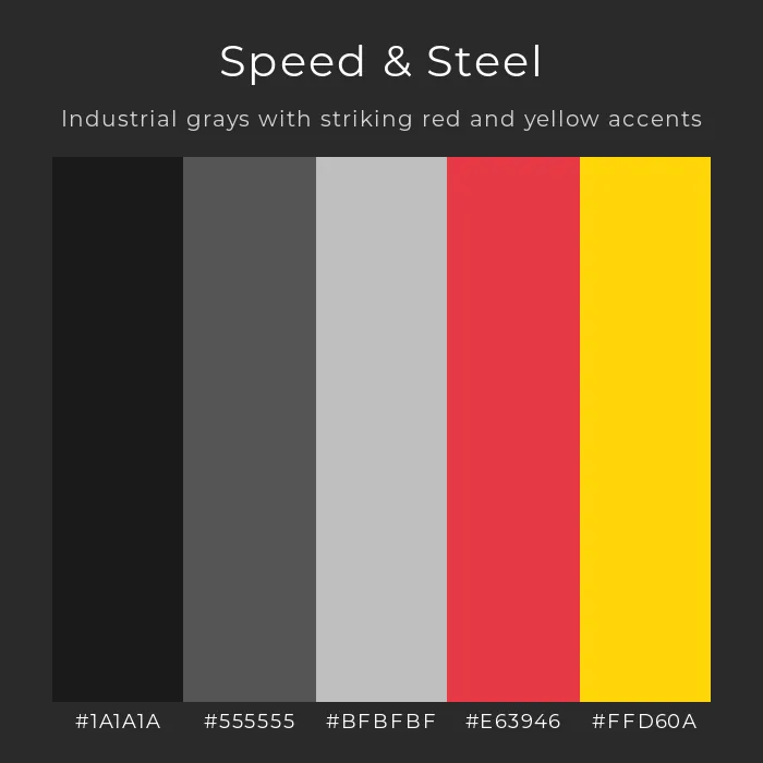
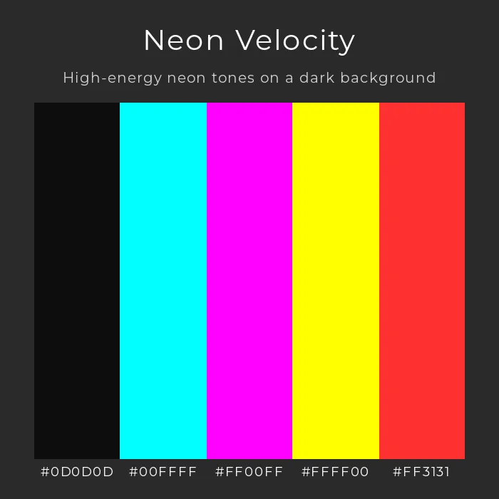
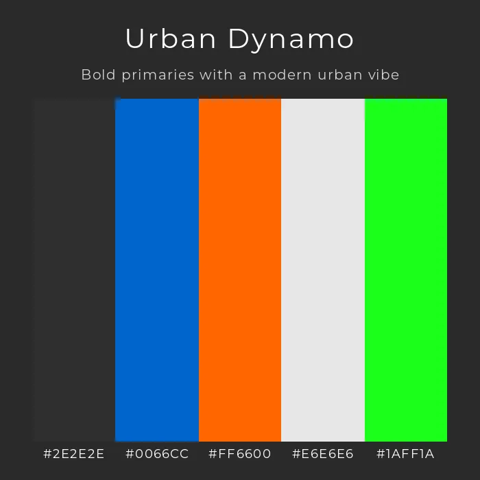
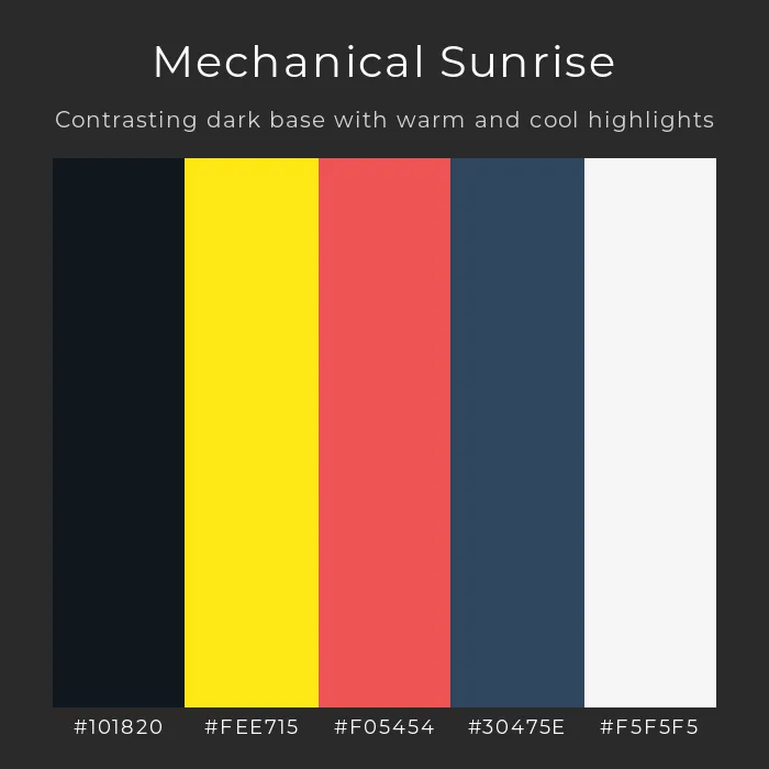
The Futurist color palette is typically bold and high-contrast. It uses vibrant colors to enhance the sense of dynamism and energy. Strong reds, yellows, and blues are often used alongside stark blacks and whites to create a powerful visual impact.

Here are some Futurist color palette examples to inspire your graphic design projects:

speed & steel color palette

Futurist color palette – Speed & Steel. Generated using mew.design.

neon velocity color palette

Futurist color palette – Neon Velocity. Generated using mew.design.

 urban dynamo color palette

Futurist color palette – Urban Dynamo. Generated using mew.design.

 mechanical sunrise color palette

Futurist color palette – Mechanical Sunrise. Generated using mew.design.

Layout & Composition: Lines of Force

Futurist compositions are defined by “lines of force”—strong diagonal lines that direct the viewer’s eye and create a feeling of forward momentum. Layouts of Futurism graphic design are often asymmetrical and fragmented, showing objects from multiple perspectives at once to simulate movement through time and space.

Imagery & Motifs: The Cult of the Machine

Futurism rejected the natural forms of Art Nouveau style. Instead, its imagery was obsessed with technology in design. Common motifs include:

  • Cars, trains, and airplanes depicted in motion.
  • Industrial cityscapes and factories.
  • Abstract representations of speed, sound, and light.

futurism graphic design motifs

Futurism Graphic Design – Lines of Force & Machine Motifs. Generated using mew.design.

Futurism Graphic Designers and Master Artists

The creators of Futurism design style were multidisciplinary artists who applied their philosophy to painting, sculpture, poetry, and graphic arts, effectively acting as the first Futurist graphic designers.

Filippo Tommaso Marinetti

As the founder and chief theorist of the Futurism movement, Marinetti was a master of propaganda. His manifestos and books were themselves works of art, using revolutionary typography to visually express the sounds and chaos of war and industry.

  • Key Work: His 1914 book Zang Tumb Tumb is the definitive example of “words in freedom,” a typographic masterpiece that broke all the rules of traditional book layout.

filippo tommaso marinetti zang tumb tumb

Zang Tumb Tum. Source: arthistoryproject.com

Umberto Boccioni

A leading painter and sculptor of the Futurism movement, Boccioni was obsessed with capturing dynamism. His work brilliantly illustrates the Futurist goal of placing the “spectator in the center of the picture.”

  • Key Work: His sculpture Unique Forms of Continuity in Space (1913) is a timeless icon of the machine age, depicting a figure striding powerfully into the future.

umberto Boccioni unique forms of continuity in space

Unique Forms of Continuity in Space. Source: metmuseum.org

Futurism Design Style in the Modern World: Contemporary Applications

While the original Futurist movement was short-lived, its principles of dynamism and forward-thinking energy are alive and well in modern Futurism and contemporary design.

  • Sports Branding: Brands related to speed and performance, like Nike and Adidas, often use strong diagonal lines, motion blur, and dynamic typography to convey energy and athleticism.

    modern futurism sports branding poster

    Speed and power in Futurism style sports branding. Generated using mew.design.

  • Automotive and Tech Industries: Car and technology advertisements frequently use Futurism principles to communicate innovation, speed, and cutting-edge design.

    modern futurism car advertisment

    Sleek performance captured in Futurism design style. Generated using mew.design.

  • Posters and Events: Futurism posters are effective for music festivals, tech conferences, and any event that wants to project a high-energy, modern, and forward-looking identity.

    modern futurism music event poster

    High-energy vibes in Futurism style event design. Generated using mew.design.

How To Create a Futurist-Style Graphic Design with AI

Ready to inject some high-octane energy into your graphics? Try Mew Design, an AI-powered design agent that creates precise, dynamic graphics from your text prompts. Here are the key features of Mew Design:

  • AI Design Agent System: A multi-agent AI team, where each “Meow” specializes in unique styles and scenarios to deliver unique designs.
  • Precise Text & Layout Control: Unlike typical AI art tools, Mew Design produces clean layouts without text errors or messy alignment.
  • Interactive Refinement: Easily fine-tune your designs through follow-up prompts to get exactly what you want.
  • Wide Range of Design Types: Generate not just posters but banners, social media graphics, presentations, name tags, and more.
  • Customizable & Editable Outputs: Upload logos, images, and QR codes to personalize your visuals fully.

A Step-by-Step Prompt Guide

  1. Sign in or create an account on Mew Design to get started.

  2. Enter your design prompt in simple text, describing your Futurist-inspired graphic. Then, click the Go button to start generating.

    input design prompt

    Prompt Example (for a Futurism poster): Create a poster for a ‘Future Forward Tech Conference’. Use a dynamic Futurism design style. The poster should have a strong sense of speed, using diagonal lines and motion blur effects. Use a bold, sans-serif font and scatter the text ‘Innovation, Speed, Technology’ across the page. The color palette should be high-contrast red, black, and white.

  3. Let the AI Design Agent analyze your prompt and create the Futurism poster for you.

  4. Review the generated design and refine your design using follow-up prompts — adjust colors, typography, and layout details until it matches your vision perfectly.

    edit the ai generated graphic design

    Example Follow-up Prompts: “Make the diagonal lines more prominent.” or “Increase the motion blur on the background image.”

  5. Finally, export your finished Futurism graphic, ready for print or digital use.

🚀

Ready to Design a Futurism Graphic?

From event posters to social media graphics, Mew Design is your AI agent for creating bold, energetic, and professional designs that capture the spirit of Futurism.

Try Mew Design for Free

Conclusion

Futurism was a radical and powerful movement that forever changed the possibilities of visual communication. It taught designers to embrace dynamism, to see typography as an expressive tool, and to find beauty in the energy of the modern world. Its legacy is a reminder that design can be a force for change, constantly pushing towards the future.

Now that you’ve learned about the Futurist graphic design style, explore the revolutionary order of Bauhaus or the chaotic freedom of Dada in our ultimate guide to graphic design styles.

Art Nouveau Design Style: A Guide to Nature's Elegant Curves

art nouveau design style infograhic

Infographic of Art Nouveau Design Style. Generated using mew.design

Picture the iconic entrances to the Paris Métro, the shimmering glasswork of a Tiffany lamp, or a vintage poster of a graceful woman with impossibly long, flowing hair. This distinct and beautiful visual world is the legacy of Art Nouveau, a style that chose the flowing lines of nature over the rigid forms of the past.

Art Nouveau was a revolutionary movement that sought to erase the line between fine art and applied arts, creating a total aesthetic that could be woven into the fabric of everyday life. While this intricate style was once the domain of master draftsmen, modern AI design generation tools like Mew Design, now allow anyone to instantly generate graphics infused with Art Nouveau’s signature elegance.

As one of the most beautiful and influential graphic design styles detailed in our ultimate guide, understanding Art Nouveau design style is essential for any designer interested in decoration, elegance, and history. This article explores its origins, its key visual hallmarks, and its lasting influence on contemporary design.

The Origins of Art Nouveau: A Rebellion in the Name of Beauty

The Art Nouveau graphic design style flourished across Europe and the United States near the end of the 19th century, from roughly 1890 to 1910. It was a direct, passionate rebellion against the stuffy, academic historicism and the cluttered, industrial feel of the Victorian era.

Its proponents wanted to create something new—a “New Art” that was modern, unified, and deeply inspired by the most powerful source of beauty they knew: nature. The goal was to create a “total work of art” (Gesamtkunstwerk), where a building, its furniture, its wallpaper, and even the advertisements for products sold inside it would all share a single, harmonious visual language.

The Visual Hallmarks: Key Characteristics of Art Nouveau

To recognize the Art Nouveau graphic design style, you must look for its signature organic forms and decorative elegance. These are the defining characteristics that give the style its unique and timeless appeal.

Typography: Integrated and Artistic

In Art Nouveau graphic design, typography is rarely just text—it’s part of the illustration. Art Nouveau typography is often hand-drawn, with letters that stretch, curve, and flow with the rest of the composition.

The legibility of the text was often secondary to its artistic integration into the overall design, making the words themselves feel as natural and alive as the images they accompanied.

Color Palette: Inspired by Nature

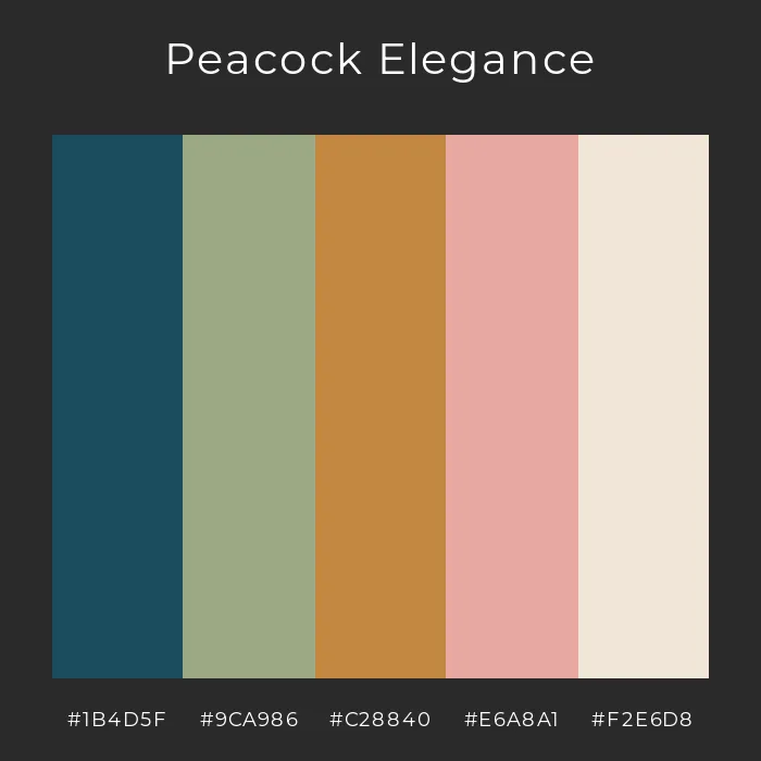
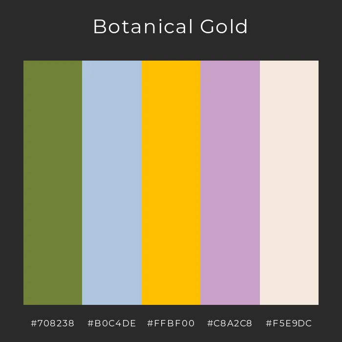
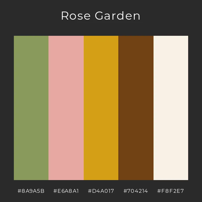
The Art Nouveau color palette is typically derived from the natural world. It features rich, muted, and earthy tones like olive green, deep red, mustard yellow, and brown. These are often complemented by soft, delicate pastels like lilac, sage, and cream. Gold was also used frequently as an accent to add a touch of luxury and light.

peacock elegance color palette

Art Nouveau color palette – Peacock Elegance. Generated using mew.design.

botanical gold color palette

Art Nouveau color palette – Botanical Gold. Generated using mew.design.

rose garden color palette

Art Nouveau color palette – Rose Garden. Generated using mew.design.

twilight nouveau color palette

Art Nouveau color palette – Twilight Nouveau. Generated using mew.design.

Layout & Composition: Asymmetrical and Flowing

Art Nouveau design rejected rigid, symmetrical layouts. Instead, its compositions are fluid, asymmetrical, and full of movement. The defining feature is the “whiplash curve”—a dynamic, S-shaped, and energetic line that mimics the stems of plants, vines, or flowing hair. This creates a sense of life and grace throughout the design.

Imagery & Motifs: The Celebration of Nature

Art Nouveau patterns and illustrations are filled with:

  • Elegant, idealized female figures with long, flowing hair.
  • Stylized flowers and plants, especially lilies, irises, and poppies.
  • Insects and birds, most notably dragonflies and peacocks, chosen for their delicate forms and iridescent colors.

image showing art nouveau patterns

Art Nouveau Patterns: From Mucha classic posters to modern product packaging, Art Nouveau stays timeless. Generated using mew.design.

Art Nouveau Designers and Master Artists

Art Nouveau was an international movement, but its public face was defined by a few pioneering artists who became the most famous Art Nouveau graphic designers of their time. They masterfully applied the style’s principles to posters, illustrations, and print, shaping the look and feel of the era and elevating commercial art to a new level of sophistication.

Alphonse Mucha

A Czech artist working in Paris, Mucha is the undisputed star of Art Nouveau poster design. The Alphonse Mucha style is defined by its depiction of beautiful, serene women in flowing robes, surrounded by halos of intricate patterns and lush florals. His work elevated advertising to high art.

  • Key Work: His posters for the actress Sarah Bernhardt and for brands like Job rolling papers are iconic examples of his signature aesthetic.

mucha art nouveau poster design for sarah bernhardt

Sarah Bernhardt. Source: wikiart.org

Henri de Toulouse-Lautrec

While also a key Art Nouveau artist, Toulouse-Lautrec’s work was grittier and more energetic than Mucha’s. He captured the dynamic, bohemian spirit of Parisian nightlife at venues like the Moulin Rouge, using bold outlines and flat colors.

  • Key Work: His 1891 poster Moulin Rouge: La Goulue is a masterpiece of dynamic composition and character.

art nouveau poster moulin rouge la goulue

Moulin Rouge: La Goulue. Source: wikiart.org

Gustav Klimt

A leading figure of the related Vienna Secession movement, Klimt’s paintings are famous for their ornate, decorative qualities. His use of gold leaf, intricate patterns, and symbolic imagery heavily influenced the more luxurious and artistic side of the Art Nouveau style.

  • Key Work: The painting The Kiss (1908) perfectly embodies the blend of sensuality, symbolism, and lavish decoration.

art nouveau style painting the kiss 1908

The Kiss. Source: wikiart.org

Art Nouveau in the Modern World: Contemporary Applications

The elegance of Art Nouveau design style continues to inspire designers today. Its connection to nature and artistry makes it a powerful choice for brands wanting to appear luxurious, sophisticated, and authentic.

  • Branding & Packaging: Art Nouveau branding is perfect for artisanal and organic products—cosmetics, craft spirits, gourmet foods, and chocolate. The intricate illustrations and elegant typography immediately signal quality and craftsmanship.
  • Posters & Publishing: The style is still a popular choice for Art Nouveau posters advertising art exhibitions, musical performances, and theater. It’s also frequently used for the covers of fantasy and historical fiction novels.
  • A Note on Art Nouveau vs Art Deco: Many people confuse these two styles. The easiest way to remember is that Art Nouveau is organic, flowing, and nature-based, while Art Deco is sharp, geometric, and machine-based.

art nouveau in modern graphic design

A mood board showcasing modern examples: a luxury gin bottle label, a book cover, and a boutique hotel logo, all using Art Nouveau elements. Generated using mew.design.

How To Create an Art Nouveau-Style Design With AI

Drawn to the elegance of Art Nouveau? With Mew Design, you can easily channel the spirit of Mucha and create beautiful, intricate Art Nouveau designs in moments.

Step 1: Define Your Core Elements. Decide on the key text for your design, such as a product name for a label, a title for a social media post, or event details for a poster.

Step 2: Input Your Design Prompt and Generate. Sign up or log in to Mew Design, and describe what you need using the style’s signature keywords.

input art nouveau design prompt

High-Quality Prompt Example (for a poster): Create a poster for a ‘Botanical Gin Festival’. Use a classic Art Nouveau style, reminiscent of Alphonse Mucha. Feature an elegant woman with long, flowing hair surrounded by juniper branches and flowers. Use a muted color palette of olive green, gold, and cream. The font should be ornate and integrated into the design. The text should say ‘The Annual Gin & Botanicals Fair’.

Step 3: Refine and Edit. Unlike common AI text-to-image tools that lack editability and practicality for real-world use, you have full control over the generated graphics in Mew Design. Just ask for changes to perfect your design.

edit the ai generated art nouveau design

Example Follow-up Prompts: “Make the woman’s hair flow around the text more.” or “Add more intricate flower patterns to the border.”

Step 4. Export Your Design. Once you’re satisfied, click the Export button to save your Art Nouveau–style poster.

🚀

Ready to Create Art Nouveau Design?

Whether you’re branding a luxury product or creating a beautiful event poster, Mew Design helps you produce graphics that capture the spirit of Art Nouveau in seconds.

Try Mew Design for Free

Conclusion

Art Nouveau was more than just a style; it was a philosophy that sought to bring beauty into every corner of modern life. Its legacy is its timeless elegance and its reminder that design inspired by the natural world will never go out of fashion.

Now that you’ve explored the organic curves of Art Nouveau design, see how it contrasts with the sharp geometry of Art Deco and the luxurious Baroque style in our ultimate guide to graphic design styles.

Baroque Design Style: A Guide to 17th Century Drama & Opulence

baroque graphic design style infographic

Infographic of Baroque graphic design style. Generated using Mew.Design.

Imagine the gilded halls of the Palace of Versailles, the intense, dramatic lighting of a Caravaggio painting, and the complex, emotional resonance of a Bach cantata. This world of grandeur, emotion, and intricate detail is the essence of the Baroque design style.

While originating centuries before graphic design was a formal profession, the principles of the Baroque have left an indelible mark on visual culture. It is a language of power, passion, and opulence. And while creating such intricate designs once required master artisans, today’s tools, including AI design agents like Mew Design, make it possible to capture the spirit of this historic style in seconds.

As one of the most foundational aesthetics covered in our ultimate guide to graphic design styles, understanding the Baroque is key to mastering decorative and luxurious design. This article explores its history, its key visual characteristics, and how you can apply its dramatic flair to your own projects.

The Origins of the Baroque Design Style: A Story of Power, Persuasion, and Passion

The Baroque design style emerged in the early 17th century in Rome, a time of profound religious and political change. Born from the Catholic Church’s Counter-Reformation, it was designed as a powerful tool to combat the austerity of Protestantism. The goal was to create an art form that was not just seen, but felt—one that could inspire awe, captivate the senses, and communicate religious glory with overwhelming emotion. This dramatic and persuasive approach, which quickly spread to the absolute monarchies of Europe, established a graphic design style defined by its grandeur, dynamism, and an unapologetic embrace of ornamentation.

The Visual Hallmarks: Key Characteristics of Baroque Graphic Design

To identify the Baroque style, you need to look for its signature combination of drama and detail. These are the core Baroque design elements that give the style its powerful character.

Typography: Ornate and Expressive

Baroque typography is anything but quiet. It favors elaborate, calligraphic scripts and high-contrast serif fonts that feel both formal and full of life. Letters were often decorated with extensive swashes and flourishes, turning the text itself into a piece of decorative art. The goal was not just readability, but artistry.

Color Palette: Deep, Rich, and Dramatic

The Baroque color palette is deep, rich, and intense. It features dark, saturated hues like burgundy, deep green, and ultramarine, which are often contrasted with brilliant, shining gold. The most crucial element, however, is the use of light. The principle of chiaroscuro in design—the strong contrast between light and dark—is central to creating the style’s signature drama and depth.

Layout & Composition: Dynamic and Full of Motion

Unlike the calm, stable balance of the Renaissance, Baroque compositions are bursting with energy. Layouts often use swirling, diagonal, and overlapping forms to create a powerful sense of movement and dynamism. There is a “more is more” approach, filling the space with elements that guide the eye on an energetic journey through the piece.

Imagery & Motifs: Grand and Intricate

Baroque ornaments and flourishes are key to its identity. Compositions are rich with intricate details, including:

  • Acanthus leaves, scrolls, and elaborate filigree.
  • Cherubs, angels, and mythological figures.
  • Complex, ornate frames and cartouches that encircle text or central images.

baroque design style in modern application

Classic meets modern: Baroque drama reimagined in luxury design. Generated using mew.design

Baroque Graphic Designers and Master Artists

While the formal role of a “graphic designer” didn’t exist in the 17th century, the master artists of the period acted as the era’s primary visual communicators. The principles established by these pioneering Baroque graphic designers and artists defined the visual language for centuries, especially in the realm of decorative and print arts.

Caravaggio

An Italian painter, Caravaggio is the master of tenebrism and chiaroscuro. His revolutionary use of intense light and deep shadow created an unparalleled level of drama and psychological realism. His work taught future artists how to use contrast to command attention and evoke powerful emotions.

  • Key Work: The Calling of Saint Matthew (1600) is a perfect example of a single beam of light illuminating a dark scene, creating a moment of intense spiritual drama.

caravaggios calling saint matthew

Source: Prime Matters

Gian Lorenzo Bernini

A sculptor and architect, Bernini captured the essence of Baroque dynamism. His sculptures are not static; they depict figures in the midst of powerful action and intense emotion.

  • Key Work: Apollo and Daphne (1625) masterfully freezes a moment of transformation and movement, a hallmark of the Baroque aesthetic.

apollo and daphne

Source: arthistoryproject.com

Baroque in the Modern World: Contemporary Applications

Though centuries old, the Baroque design style remains a powerful tool for brands wanting to communicate luxury, tradition, and sophistication.

  • Branding & Logos: Luxury Baroque branding is effective for high-end fashion, spirits, and artisanal food products. The ornate details immediately signal heritage and premium quality.

    baroque design style perfume box

    Ornate Baroque-style luxury perfume box. Generated using mew.design.

  • Event Design: The style is a perfect match for formal, high-end events. Baroque wedding invitations, gala programs, concert posters, and menus use its flourishes and elegant typography to create a sense of occasion.

    baroque style wedding invitation

    A Baroque inspired wedding invitation. Generated using mew.design.

  • Packaging & Publishing: Classic book covers, wine and spirit labels, and packaging for gourmet foods often use Baroque elements to convey a sense of timeless craftsmanship and quality.

    baroque design style whisky label

    A Baroque style whisky label. Generated using mew.design.

How To Create a Baroque-Style Design With AI

Inspired by the drama and detail of the Baroque graphic design style? With Mew Design, you can channel the spirit of the masters without needing centuries of practice to create beautiful graphics.

Step 1: Define Your Core Elements. Start with the essential information for your Baroque style design, whether it’s for a social media post, a flyer, a packaging, or a poster: the event name, date, location, and any other key text.

Step 2: Input Your Prompt. Sign in to Mew Design and use natural language to describe your vision to a “Meow Designer”. The key is to use descriptive words that capture the essence of the Baroque style. Then, click the GO button to start creating your Baroque style design with AI.

input prompt for a baroque style design

Example Prompt (Poster): Create a poster for a ‘Vivaldi by Candlelight’ concert. Use a dramatic Baroque style. The background should be dark with high contrast lighting, like chiaroscuro. Use an ornate, calligraphic font for the headline. Add intricate gold filigree and scroll flourishes in the corners. Include the date ‘November 15th’ and location ‘St. Mark’s Basilica’.

Step 3: Refine and Edit. Mew Design’s HTML-based output means you have full control. If the first draft isn’t perfect, simply ask for changes.

edit the generated baroque style design

Example Follow-up Prompts: “Make the gold flourishes more elaborate.” or “Change the main font to a classic serif style.”

Step 4: Export or Publish. Once everything looks good, click Export to save your design, or choose Publish to share your work and inspire other users.

🚀

Ready to Design with Baroque Style?

Whether you’re designing for a luxury brand, a formal event, or a passion project, Mew Design helps you create opulent, professional graphics quickly.

Try Mew Design for Free

Conclusion

The Baroque style is a powerful reminder that design can be more than just functional—it can be emotional, persuasive, and awe-inspiring. Its legacy of drama, motion, and intricate detail continues to influence designers who want to create work that feels rich, luxurious, and full of life.

Now that you’ve explored the opulence of the Baroque, why not discover the sleek geometry of Art Deco or the organic curves of Art Nouveau in our Ultimate Guide to Graphic Design Styles?

The Ultimate Guide to Graphic Design Styles (From Baroque to Y2K)

graphic design style guide

Generated using mew.design

Ever wondered what makes a brand feel timelessly elegant versus bold and modern? The secret lies in its graphic design style.

A graphic design style is more than just a collection of pretty visuals; it’s a cohesive visual language that communicates a brand’s personality, values, and core message to the world. With the rise of AI technology, powerful AI Design Agents like Mew Design can now help you generate stunning graphics in various styles through simple natural language prompts.

This comprehensive guide is your go-to resource for exploring the rich history of design, understanding the key characteristics of each style, and making informed decisions for your own brand and creative projects.

What Are Graphic Design Styles & Why Do They Matter?

Simply put, a graphic design style is a consistent set of visual rules—governing colors, shapes, typography, and composition—that work together to create a specific mood and feeling. Understanding them is crucial because they are a powerful tool for:

  • Branding: A consistent style builds recognition and trust. Think of Apple’s clean Minimalism, which immediately communicates sophistication and ease-of-use.
  • Communication: Style sets the tone before a single word is read. The raw, chaotic energy of a punk rock poster communicates a vastly different message than the structured, trustworthy layout of a law firm’s brochure.
  • Connection: It connects with a specific target audience by speaking their visual language. A playful, colorful style might resonate with a younger audience, while a more subdued, elegant style might appeal to a luxury market.

 graphic design style comparison coffee brand infographic

Graphic design style comparison infographic featuring a coffee brand. Generated using Mew.Design.

A Visual Timeline of Graphic Design Styles

Graphic design has constantly evolved, shaped by art movements, technological advancements, and cultural shifts. This timeline offers a glimpse into how visual language has changed, with each era building upon or rebelling against the last.

  • 17th Century & The Dawn of Print: Before graphic design was a profession, the dramatic, ornate principles of the Baroque period influenced early print decoration, setting a precedent for visual richness.
  • Late 19th - Early 20th Century: A rebellion against industrial uniformity begins. The flowing, organic lines of Art Nouveau give way to the radical abstraction of Avant-Garde movements like Futurism and Constructivism, and the sleek geometry of Art Deco and the Bauhaus.
  • Mid-20th Century: The post-war era ushers in two distinct paths. The clean, grid-based order of the Swiss Style dominates corporate design, while the playful optimism of Mid-Century Modern captures the spirit of consumer culture.
  • Late 20th Century: A cultural explosion is mirrored in design. Postmodernism intentionally breaks the rules of modernism, while Grunge reflects the raw, unpolished aesthetic of the underground music scene.
  • The Digital Age (Late 90s - Today): The rise of the computer and internet creates entirely new design paradigms. We see the Y2K aesthetic, the realism of Skeuomorphism, the clarity of Flat Design, and now new dimensions with 3D, Glassmorphism, and AI-powered creation.  graphic design style timeline infographic

    Timeline infographic of graphic design styles. Generated using Mew.Design.

The Complete A-Z Guide to Graphic Design Styles

Here is your essential reference guide to the most influential graphic design styles.

Historical & Foundational Styles

These are the seminal design movements that broke from the past and created the foundational principles for modern visual communication. Understanding these historical styles is key to appreciating where today’s trends come from and how visual language has evolved.

1. Baroque

The Baroque style emerged in Europe in the early 17th century, a period of dramatic scientific and religious change. While primarily an art and architectural movement, its core principles of drama, grandeur, and emotional intensity heavily influenced early print and decorative arts. This opulent design style can be seen as a precursor to more decorative aesthetics, establishing a visual language rich with motion, detail, and awe-inspiring complexity.

Key Figures: Caravaggio, Gian Lorenzo Bernini (in art and sculpture).

Key Characteristics:

  • Drama & Emotion: Strong contrasts between light and shadow (chiaroscuro) to create dramatic tension.
  • Ornate Detail: Rich, intricate ornamentation, including flourishes, scrolls, and detailed illustrations.
  • Sense of Motion: Dynamic compositions that feel energetic and full of movement.

Modern Applications: Its principles are echoed in modern maximalist designs. It’s perfect for brands wanting to convey luxury, tradition, and dramatic flair, such as in high-end wine labels, wedding invitations, and classic book covers.

baroque style in modern graphic design example

Bold 3D typography meets ornate Baroque details in a vibrant, modern vertical collage. Generated using Mew.Design.

Famous Work: The elaborate title pages and engravings in books from the 17th century often showcase Baroque design principles.

-> Explore our complete guide to Baroque-inspired Design.

2. Art Nouveau

Flourishing in Europe from roughly 1890 to 1910, Art Nouveau was a revolutionary graphic design style born from a desire to break free from the rigid historical styles of the Victorian era. It aimed to modernize design by integrating art into everyday life, drawing its core inspiration from the flowing, untamed forms of the natural world.

Key Figures: Alphonse Mucha, Henri de Toulouse-Lautrec, Gustav Klimt.

Key Characteristics:

  • Organic Forms: Dominated by flowing, sinuous, and asymmetrical “whiplash” curves inspired by nature (vines, flowers, insects).
  • Decorative Illustration: Featured elegant, stylized figures (especially women with long, flowing hair) seamlessly integrated with their surroundings.
  • Integrated Typography: Lettering was often hand-drawn and became part of the artwork itself, twisting and turning with the composition.

Modern Applications: Perfect for brands wanting to convey elegance, luxury, and artistry. Often seen in packaging for cosmetics, chocolates, and alcoholic beverages, as well as in boutique hotel branding.

art nouveau graphic design style example

A vintage-style Art Nouveau packaging featuring flowing organic motifs, elegant female figure, and integrated decorative typography, inspired by Alphonse Mucha. Generated using Mew.Design.

Famous Work: Alphonse Mucha’s advertising posters for Job cigarettes and a variety of theatrical productions.

-> Explore our complete guide to Art Nouveau Design Style.

3. Futurism

Emerging in Italy in the early 20th century, just before World War I, Futurism was an avant-garde movement that celebrated dynamism, speed, technology, and the machine. This aggressive and energetic graphic design style completely rejected the past, seeking to create a new visual language that could capture the thrilling, often violent, energy of the modern world.

Key Figures: F.T. Marinetti, Umberto Boccioni.

Key Characteristics:

  • Motion & Speed: Used diagonal lines, blurred forms, and repetition to create a sense of movement.
  • Industrial Influence: Celebrated cars, planes, and industrial machinery in its imagery.
  • Expressive Typography: Broke free from traditional layouts, scattering words and letters across the page to create a dynamic, explosive effect.

Modern Applications: Its principles influence designs that aim to be energetic, bold, and forward-thinking. Seen in tech branding, sports advertising, and event posters that need to convey high energy.

futurism graphic design style example

Futurist energy meets tech innovation in this bold, kinetic hackathon poster. Generated using Mew.Design.

Famous Work: F.T. Marinetti’s experimental typography in his book Zang Tumb Tumb.

-> Discover the energetic principles of the Futurism Graphic Design.

4. Dada

Born in Zurich during World War I (around 1916), Dada was not so much a style as an anti-art, anti-war movement that rejected logic, reason, and the aesthetics of modern society. The resulting graphic design style was intentionally chaotic, irrational, and absurd, using collage and photomontage to critique politics and culture.

Key Figures: Marcel Duchamp, Hannah Höch, Tristan Tzara.

Key Characteristics:

  • Collage & Photomontage: Combined disparate images and text from newspapers and magazines to create jarring, nonsensical compositions.
  • Chance & Absurdity: Embraced randomness in its layouts.
  • Rejection of Rules: Intentionally broke all conventions of typography and composition.

Modern Applications: Its rebellious spirit lives on in punk and grunge aesthetics. Used by brands and artists who want to appear subversive, unconventional, and critical of the mainstream.

dada graphic design style example

A chaotic Dada-style collage bursting with absurd imagery, mismatched typography, and fragmented headlines. Generated using Mew.Design.

Famous Work: The experimental layouts and photomontages in magazines like Dada and the work of Hannah Höch.

-> Explore the chaotic rebellion of Dada Graphic Design.

5. Constructivism

This influential design style emerged from Russia in the early 1920s, following the Bolshevik Revolution. Rather than being purely artistic, Constructivism believed that art should serve a social purpose and be a tool for building a new, communist society. It rejected art for art’s sake in favor of functional, powerful, and socially conscious design.

Key Figures: Alexander Rodchenko, El Lissitzky.

Key Characteristics:

  • Geometric Abstraction: Used simple geometric shapes like circles, squares, and rectangles.
  • Limited Color Palette: Often restricted to red, black, and white for maximum visual impact.
  • Photomontage: Integrated photography in a dynamic way to create powerful messages.
  • Dynamic Composition: Employed strong diagonal lines to create a sense of movement and energy.

Modern Applications: Its principles of bold typography and dynamic, geometric layouts have had a massive influence on virtually all modern graphic design. It’s often referenced in political posters and activist art.

constructivism graphic design style example

A bold Constructivist-style poster featuring dynamic diagonals, geometric shapes, and photomontage—delivering a powerful, purpose-driven message in red, black, and white. Generated using Mew.Design.

Famous Work: Alexander Rodchenko’s iconic advertising posters, such as the one for the Lengiz Publishing House.

-> Learn the powerful principles of Constructivist Design.

6. Surrealism

Emerging in the 1920s in Paris, led by writer André Breton, Surrealism was a cultural movement that sought to unlock the power of the unconscious mind. The resulting graphic design style is not based on logic or reality, but on dreams, memories, and bizarre juxtapositions, creating visuals that are both unsettling and fascinating.

Key Figures: Salvador Dalí, René Magritte, Max Ernst.

Key Characteristics:

  • Dreamlike Imagery: Featured illogical scenes and strange, unexpected combinations of objects.
  • Symbolism: Used objects symbolically to explore subconscious thoughts and desires.
  • Realistic Technique: Often used highly realistic and detailed painting techniques to make the unreal seem believable.

Modern Applications: Heavily influences modern illustration, advertising, and poster design where the goal is to be thought-provoking, strange, and memorable.

surrealism graphic design style example

A surrealist poster blending hyper-realistic dream imagery and symbolic objects in an uncanny, thought-provoking composition. Generated using Mew.Design.

Famous Work: Salvador Dalí’s painting The Persistence of Memory with its melting clocks.

-> Dive into the dream world of Surrealist Design.

7. Bauhaus

The Bauhaus design style was born from the influential Bauhaus school in Germany (1919-1933). Founded by Walter Gropius, it emerged as a response to the decorative excesses of older styles, aiming to unite art, craft, and technology to create functional and beautiful objects for modern industrial society.

Key Figures: Walter Gropius, László Moholy-Nagy, Herbert Bayer.

Key Characteristics:

  • “Form Follows Function”: The core principle that design should be practical and serve its purpose above all else.
  • Geometric Purity: Strong emphasis on simple geometric forms like the circle, square, and triangle.
  • Sans-Serif Typography: Advocated for clean, functional sans-serif fonts, often in lowercase.
  • Asymmetrical Layouts: Used structured but dynamic asymmetrical grids.

Modern Applications: The Bauhaus philosophy is the foundation for much of modern design, particularly in UI/UX, furniture design, and corporate branding where clarity and functionality are paramount.

bauhaus graphic design style example

A vibrant Bauhaus-inspired cover featuring bold geometric shapes, primary colors, and playful sans-serif typography in a dynamic, asymmetrical layout. Generated using Mew.Design.

Famous Work: Herbert Bayer’s universal alphabet and the iconic Wassily Chair by Marcel Breuer.

-> Discover the foundational principles of the Bauhaus Graphic Design.

8. Art Deco

Peaking in the 1920s and 1930s, Art Deco was a visual celebration of the glamour, exuberance, and machine-age modernity of the Roaring Twenties. Its name comes from the 1925 Exposition Internationale des Arts Décoratifs et Industriels Modernes in Paris, and it stood for luxury, progress, and a confident belief in the future.

Key Figures: A.M. Cassandre, Erté (Romain de Tirtoff).

Key Characteristics:

  • Geometric Shapes: Strong emphasis on sharp, repeating geometric patterns like zig-zags, chevrons, and sunbursts.
  • Symmetry & Bold Lines: Compositions are often strictly symmetrical with bold, clean lines.
  • Luxurious Feel: Used sleek, streamlined forms and visually rich materials like chrome, gold, and polished lacquer.
  • Typography: Favored tall, condensed, geometric sans-serif fonts.

Modern Applications: Ideal for high-end, luxury brands. Commonly used in logos for fashion and film, hotel branding, and packaging for exclusive products.

art deco graphic design style example

A glamorous Art Deco poster showcasing symmetrical geometric patterns, bold lines, and luxurious gold and black tones—exuding 1920s elegance and modern sophistication. Generated using Mew.Design.

Famous Work: The poster for the film Metropolis and the iconic cover of The Great Gatsby.

-> See stunning examples in our Art Deco Style guide.

9. Swiss Style (International Typographic Style)

Developed in Switzerland in the 1950s, this highly influential design style was built on the modernist principles of the Bauhaus. It sought a universal, objective, and rational approach to design, believing that clear communication should always be the primary goal.

Key Figures: Armin Hofmann, Josef Müller-Brockmann.

Key Characteristics:

  • Grid System: Unwavering commitment to a mathematical grid for layout, creating order and unity.
  • Sans-Serif Typography: Almost exclusive use of clean sans-serif fonts like Helvetica and Univers, often set flush-left and ragged-right.
  • Objectivity: Rejected decoration and personal expression in favor of objective photography and clear, concise information.
  • Negative Space: Used ample white space as an active and important element of the design.

Modern Applications: Its principles are the foundation of modern web design, UI/UX, and corporate branding. It conveys clarity, professionalism, and trustworthiness.

swiss graphic design style example

A poster rooted in Swiss Style principles — clean typography, a strict grid, and precise alignment bring clarity and order to this rational, minimalist vision of visual communication’s future. Generated using Mew.Design.

Famous Work: Josef Müller-Brockmann’s concert posters, which masterfully use typography and geometric forms.

-> Learn the principles in our guide to the Swiss Style.

10. Mid-Century Modern

A broad design movement that became popular in the post-World War II era, roughly from 1945 to 1965, the Mid-Century Modern graphic design style reflected the era’s optimism, consumerism, and fascination with new technologies. It is known for being friendly, accessible, and charmingly retro.

Key Figures: Saul Bass, Paul Rand, Ray and Charles Eames.

Key Characteristics:

  • Playful & Organic: Characterized by clean lines mixed with gentle, organic curves.
  • Asymmetry: Compositions were often asymmetrical yet balanced.
  • Illustrative: Featured friendly, often quirky illustrations and icons.
  • Color Palette: Used a distinct palette of bright, optimistic colors (like mint green, atomic orange, and turquoise) contrasted with earthy tones.

Modern Applications: Evokes a sense of nostalgia and retro charm. Perfect for illustration, branding for startups, and packaging that wants to feel friendly and accessible.

mid century modern graphic design style example

A charming Mid-Century Modern packaging design with playful illustrations, retro colors, and friendly typography—blending vintage warmth with contemporary appeal. Generated using Mew.Design.

Famous Work: Saul Bass’s iconic movie posters and title sequences (e.g., Anatomy of a Murder).

-> Discover the charm of Mid-Century Modern Design.

11. Psychedelic

Emerging from the 1960s counter-culture movement, Psychedelic design was a visual rebellion against the rigid modernism of the time, heavily influenced by psychedelic music and hallucinogenic experiences. It aimed to create a visual representation of an altered state of consciousness.

Key Figures: Wes Wilson, Victor Moscoso, Peter Max.

Key Characteristics:

  • Distorted Visuals: Featured swirling, melting, and abstract shapes that created a mind-bending effect.
  • Illegible Typography: Hand-drawn lettering that was often distorted to the point of being unreadable, becoming part of the overall image.
  • Vibrating Colors: Used intense, high-contrast, and often clashing color combinations to create a sense of vibration.

Modern Applications: Used for music festival posters, album art, and brands that want to convey a creative, free-spirited, or mind-expanding vibe.

psychedelic graphic design style example

A mind-bending psychedelic poster with swirling forms, vibrating colors, and warped typography—capturing the spirit of a cosmic music experience. Generated using Mew.Design.

Famous Work: The concert posters for venues like The Fillmore in San Francisco.

-> Understand the rebellious spirit of the Psychedelic Style.

12. Pop Art

The Pop Art design style began in the 1950s and exploded in the 1960s, challenging fine art traditions by incorporating imagery from popular culture like advertising and comic books. It blurred the lines between high and low art, celebrating the mundane and the commercial.

Key Figures: Andy Warhol, Roy Lichtenstein.

Key Characteristics:

  • Mass Culture Imagery: Used images from advertising, comic books, and everyday consumer goods.
  • Bold & Vibrant: Employed bright, saturated colors and bold outlines.
  • Repetition: Often repeated images within a single work to reflect mass production.
  • Ben-Day Dots: Roy Lichtenstein famously used dots to mimic the look of commercial comic book printing.

Modern Applications: This style remains powerful in advertising, editorial illustration, and fashion for creating bold, ironic, and eye-catching visuals.

pop art graphic design style example

A bold Pop Art–inspired ad bursting with comic flair, saturated color, and punchy repetition—celebrating the everyday with ironic, high-impact style. Generated using Mew.Design.

Famous Work: Andy Warhol’s Campbell’s Soup Cans series.

-> Learn how Pop Art continues to influence modern design.

Modern & Contemporary Styles

As technology advanced and culture fragmented, the strict rules of modernism gave way to more diverse, personal, and sometimes rebellious types of graphic design. These contemporary styles reflect the complexity of our modern world, from extreme simplicity to layered chaos.

13. Postmodernism

Emerging in the late 1970s and 1980s, the Postmodern design style was a direct, often playful, rebellion against the rigid rules and perceived seriousness of modernism and the Swiss Style. It declared that design could be expressive, decorative, and eclectic, breaking free from the “form follows function” mantra.

Key Figures: Wolfgang Weingart, April Greiman, Paula Scher.

Key Characteristics:

  • Rule-Breaking: Intentionally broke grids, mixed typefaces, and layered elements in a seemingly chaotic way.
  • Eclectic: Freely mixed historical styles and different aesthetics together.
  • Expressive & Playful: Favored collage, bold colors, and expressive, decorative forms.

Modern Applications: Its influence is seen in designs that are expressive, layered, and unconventional. Zine culture, experimental posters, and brands with a rebellious identity often draw from postmodern principles.

postmodernism graphic design style example

A rule-breaking Postmodern zine cover bursting with layered type, clashing styles, and collage chaos—where design defies order in favor of expression. Generated using Mew.Design.

Famous Work: The experimental typography of Wolfgang Weingart and the early digital work of April Greiman.

-> Explore the rule-breaking freedom of Postmodern Design.

14. Minimalism

While its roots are in modernism, Minimalism as a distinct graphic design style became dominant in the late 20th and early 21st centuries. It is a philosophy of “less is more,” believing that a message can be more powerful when all non-essential elements are stripped away, leaving only pure, focused content.

Key Figures: Influenced by pioneers like Ludwig Mies van der Rohe (architecture) and adopted by designers like Dieter Rams (product design).

Key Characteristics:

  • “Less is More”: The core philosophy is to strip away all non-essential elements.
  • Negative Space: Uses generous white or empty space as a primary design element to create focus and elegance.
  • Simple Color Palette: Often monochromatic or uses a very limited and deliberate set of colors.
  • Clean Typography: Relies on a single, well-chosen sans-serif typeface.

Modern Applications: Dominant in tech (Apple), luxury branding (Chanel), architecture, and UI/UX design. It conveys sophistication, confidence, and clarity.

minimalism graphic design style example

A minimalist tech homepage using clarity, whitespace, and restraint to communicate precision and elegance—where every element serves a purpose. Generated using Mew.Design.

Famous Work: The branding and product design of Apple under Steve Jobs and Jony Ive.

-> Master the art of simplicity with our Minimalism guide.

15. Maximalism

A direct reaction against the restraint of minimalism, the Maximalist has emerged in recent years as a celebration of excess, individuality, and bold expression. It operates on a “more is more” philosophy, creating rich, immersive visual experiences.

Key Figures: This is a contemporary trend rather than a formal movement, with figures like designer Camille Walala and artist Hassan Hajjaj embodying its spirit.

Key Characteristics:

  • “More is More”: Fills the space with rich layers of elements, colors, and textures.
  • Eclectic & Bold: Mixes different styles, patterns, and typefaces in a single composition.
  • Vibrant Colors: Uses a fearless, saturated, and often unconventional color palette.

Modern Applications: Perfect for brands that want to appear bold, energetic, and unconventional. Common in fashion, event promotion, and hospitality design.

maximalism graphic design style example

A riot of color, type, and pattern—this Maximalist poster turns visual chaos into a bold fashion statement that refuses to be ignored. Generated using Mew.Design.

Famous Work: Recent advertising campaigns for brands like Gucci or the vibrant identity work for music festivals.

-> Dive into the vibrant world of Maximalist Design.

16. Grunge

Born from the 1990s alternative rock and grunge music scene, this graphic design style was a visual rejection of the clean, polished corporate aesthetic of the 1980s. It embraced a raw, unrefined, and often chaotic look that felt more authentic and human.

Key Figures: David Carson, Neville Brody.

Key Characteristics:

  • Distressed Textures: Incorporates grainy photos, torn paper, stains, and gritty backgrounds.
  • Chaotic Layouts: Rejects grids in favor of layered, messy, and seemingly random compositions.
  • Unconventional Typography: Uses overlapping, distorted, and sometimes illegible typefaces.

Modern Applications: Used to convey a raw, edgy, and anti-establishment attitude. Still seen in music, fashion, and youth-focused branding.

grunge graphic design style example

Grunge isn’t about perfection — it’s about emotion, texture, and rebellion. This design leans into that raw energy to create a cover that feels as gritty and authentic as the music inside. Generated using Mew.Design.

Famous Work: David Carson’s groundbreaking work for Ray Gun magazine.

-> Understand the rebellious spirit of Grunge Style.

17. Brutalism

In digital design, Brutalist emerged in the mid-2010s, inspired by the raw, unadorned concrete forms of Brutalist architecture. It’s a rugged, often uncomfortable style that prioritizes raw function and honesty over traditional aesthetics.

Key Figures: Pascal Deville, creator of the influential archive brutalistwebsites.com, helped define and popularize the digital movement.

Key Characteristics:

  • Raw & Unfinished: Often looks like unstyled HTML with raw text links and system fonts.
  • Stark & Clashing: Uses bold, often clashing colors and stark, high-contrast typography.
  • Rejection of Convention: Deliberately ignores traditional design principles of beauty and user-friendliness to make a bold statement.

Modern Applications: Used by art collectives, portfolios, and fashion brands that want to appear edgy, honest, and anti-corporate.

brutalism graphic design style example

A poster that channels Brutalist graphic design’s defiance of conventional beauty — a raw, disruptive visual that aligns with underground art culture and post-digital rebellion. Generated using Mew.Design.

Famous Work: The websites of designers and studios that embrace this raw aesthetic, like the Balenciaga website.

-> Explore the raw power of Brutalist web design.

18. Organic / Hand-drawn

As a direct response to the cold precision of digital tools, the Organic or Hand-drawn graphic design style emphasizes a human touch, imperfection, and authenticity. It’s less a specific historical movement and more a timeless philosophy that values the artist’s hand in creating a warm and personal connection with the audience.

Key Figures: Contemporary lettering artists like Jessica Hische and illustrators whose work defines brands like Mailchimp have championed this aesthetic.

Key Characteristics:

  • Imperfect Lines: Embraces the natural wobble and variation of hand-drawn lines and illustrations.
  • Natural Textures: Often incorporates paper, watercolor, or sketch-like textures.
  • Custom Typography: Features hand-lettering or friendly, accessible script fonts.
  • Earthy & Approachable Colors: Tends to use a softer, more natural color palette.

Modern Applications: Ideal for brands wanting to appear authentic, sustainable, and friendly. It’s perfect for artisanal food packaging, coffee shops, wellness apps, and children’s products.

organic graphic design style example

A packaging concept that channels the Organic graphic style — handmade, earthy, and heartfelt — designed to appeal to conscious consumers and coffee lovers who value authenticity. Generated using Mew.Design.

Famous Work: The illustrative and friendly branding of Mailchimp and the approachable illustrations used by Headspace.

-> Inject humanity into your work with the Hand-drawn Style.

19. Abstract

The Abstract graphic design style is rooted in early 20th-century fine art movements and uses form, color, and texture to create a mood rather than a literal representation. It communicates on an emotional and sensory level, freeing the design from the constraints of realism.

Key Figures: Historically influenced by artists like Wassily Kandinsky. In graphic design, Paul Rand is a master who used abstract forms for corporate identity.

Key Characteristics:

  • Non-representational: Does not attempt to depict an object realistically.
  • Focus on Composition: Relies on the interplay of shapes, lines, and colors to create a visual experience.
  • Evokes Emotion: Aims to create a feeling or convey an idea through visual sensation.

Modern Applications: Widely used in branding (especially for tech and consulting firms), packaging, and posters where a unique and thought-provoking image is desired.

abstract graphic design style example

A vibrant play of abstract shapes and layered colors that captures the spirit of innovation and emotional expression — a design that invites viewers to explore ideas beyond the literal and embrace creative freedom. Generated using Mew.Design.

Famous Work: Paul Rand’s iconic logos for IBM, ABC, and UPS, which use simple abstract shapes to create memorable identities.

-> Learn how to use Abstract forms in your designs.

20. Geometric

A timeless style with roots in many movements, the Geometric graphic design style relies on the visual power of simple shapes like circles, squares, and triangles. It creates a sense of order, stability, and technological precision.

Key Figures: The principles were central to Bauhaus and Swiss Style masters like Josef Müller-Brockmann.

Key Characteristics:

  • Shape-Based: Compositions are built primarily from circles, squares, triangles, and hexagons.
  • Order & Pattern: Often uses repetition and symmetry to create complex and visually pleasing patterns.
  • Clean & Modern: The use of sharp lines and clear shapes gives it a clean, logical, and modern feel.

Modern Applications: Extremely versatile. Used for logo design, packaging patterns, posters, and web design to create a sense of order, technology, and stability.

geometric graphic design style example

A precise composition of geometric shapes and sharp lines that embodies clarity, order, and technological sophistication. Generated using Mew.Design.

Famous Work: The pictograms and visual identity system created by Otl Aicher for the 1972 Munich Olympics.

-> See how Geometric design creates structure and beauty.

Digital & UI/UX Styles

The dawn of the personal computer and the internet opened a new frontier for visual communication. The following types of graphic design were born from the screen, created specifically for the interactive, pixel-based world of user interfaces, websites, and digital experiences. These styles prioritize usability, interactivity, and the unique properties of the digital medium.

21. Y2K Revival

The Y2K graphic design style is a recent trend fueled by nostalgia for the aesthetics of the late 1990s and early 2000s. It’s a form of retro-futurism, reinterpreting the “techno-utopian” optimism of the early internet age, a time of chunky hardware, dial-up modems, and a fascination with a digital future that seemed just around the corner.

Key Figures: A trend popularized by a new generation of designers on social media platforms like TikTok and Instagram.

Key Characteristics:

  • Early CGI Aesthetics: Features low-poly 3D models, metallic sheens, and bubble-like forms.
  • Translucent & Iridescent Elements: Mimics the look of translucent plastic hardware (like the iMac G3) and holographic textures.
  • Futuristic Typography: Uses chunky, often metallic or chrome-effect fonts.
  • Bright, Acidic Colors: A palette of shiny blues, silver, hot pink, and lime green is common.

Modern Applications: Heavily used in fashion branding, music (album art and tour visuals), and social media marketing targeting Gen Z.

y2k graphic design style example

A vibrant Y2K design with translucent plastics, metallic sheens, and chunky chrome fonts, capturing early internet nostalgia and retro-futuristic optimism. Generated using Mew.Design.

Famous Work: The visual identity and merchandise for musicians like Olivia Rodrigo and Charli XCX often incorporate strong Y2K elements.

-> Explore the retro-futurism of the Y2K Revival.

22. 3D Design / CGI

3D design uses modern software to create images and animations with depth, texture, and realism that were once impossible. It has moved from a niche special effect to a mainstream aesthetic that blends the real and the virtual.

Key Figures: This field is driven by studios and individual artists. Beeple (Mike Winkelmann) brought daily CGI art to mainstream attention, while studios like Man vs Machine create cutting-edge 3D motion graphics for global brands.

Key Characteristics:

  • Depth & Realism: Creates a tangible sense of depth and dimension.
  • Lifelike Textures: Can mimic real-world materials (like metal, glass, fabric) with incredible accuracy.
  • Fantastical Imagery: Allows for the creation of imaginative characters, environments, and abstract forms.

Modern Applications: Ubiquitous in branding for tech companies, product mockups, motion graphics, and advertising to create eye-catching, high-production-value visuals.

3d graphic design style example

A striking 3D design that blends lifelike textures and depth with imaginative, futuristic forms — delivering a polished visual that bridges reality and digital creativity. Generated using Mew.Design.

Famous Work: Apple’s fluid and detailed product launch animations are a prime example of high-end commercial 3D design.

-> Discover the immersive world of 3D Design.

23. Skeuomorphism

A popular style in early digital design, especially in the 2000s, Skeuomorphism aimed to make new technology feel familiar and intuitive. This type of graphic design achieved this by making digital interface elements mimic their real-world counterparts in look and feel.

Key Figures: Scott Forstall, former Senior VP of iOS at Apple, was a major proponent of this style in early iPhone software.

Key Characteristics:

  • Real-World Imitation: Digital elements are designed to look like physical objects (e.g., a notepad app that looks like a paper pad, a trash can icon that looks like a real bin).
  • Textures & Shadows: Uses realistic textures, gradients, and drop shadows to create a sense of depth and tangibility.

Modern Applications: While largely replaced by Flat Design in UI, its principles are still used in game design and for icons where immediate recognition is crucial.

skeuomorphism graphic design style example

A tactile app interface that brings digital elements to life by mimicking real-world textures and shadows — embodying familiarity and intuitive design through rich skeuomorphic details. Generated using Mew.Design.

Famous Work: The original interface of Apple’s iOS (up to iOS 6), with its realistic-looking Notes, Calendar, and “slide to unlock” button.

-> Revisit the era of Skeuomorphic Design.

24. Flat Design

Flat Design rose to prominence in the early 2010s as a direct reaction against skeuomorphism. It embraces the two-dimensional nature of the screen, focusing on simplicity, clarity, and usability above all else.

Key Figures: Pioneered by Microsoft with their Metro Design Language and popularized globally by Apple with the release of iOS 7.

Key Characteristics:

  • Two-Dimensional: Strips away all 3D effects like drop shadows, gradients, and textures.
  • Simplicity & Clarity: Uses simple shapes, bright solid colors, and clean.
  • Focus on Usability: Aims to create clean, easy-to-navigate user interfaces.

Modern Applications: The dominant style for modern websites, mobile apps, and software interfaces.

flat design graphic design style example

A crisp and minimal splash screen that strips away complexity — showcasing Flat Design’s clarity, bright colors, and straightforward usability for a seamless digital experience. Generated using Mew.Design.

Famous Work: The dominant style for modern websites, mobile apps, and software interfaces.

-> Explore our complete guide to Baroque-inspired Design.

25. Liquid / Abstract Flow

This hyper-modern graphic design style is defined by its fluid, amorphous, and dynamic shapes. It often uses gradients and a sense of movement to create visuals that feel organic, energetic, and futuristic.

Key Figures: As a recent trend, it’s defined more by creative agencies and tech companies than single figures.

Key Characteristics:

  • Amorphous Shapes: Uses flowing, liquid-like forms that defy rigid geometry.
  • Gradients & Color: Often employs vibrant gradients to give the shapes life and dimension.
  • Sense of Movement: The compositions feel dynamic and in motion.

Modern Applications: Popular with tech startups, creative agencies, and brands that want to appear innovative, adaptable, and on the cutting edge.

liquid graphic design style example

A dynamic blend of flowing shapes and vibrant gradients — this design pulses with movement and energy, embodying the futuristic and adaptable spirit of modern tech innovation. Generated using Mew.Design.

Famous Work: The web design and branding for companies like Stripe, which often use fluid gradients and abstract background shapes.

-> See how Liquid design creates a sense of flow.

26. Glitch Art

Glitch Art deliberately uses digital errors and artifacts for aesthetic purposes. It emerged from a fascination with technology’s imperfections, turning data corruption, pixelation, and digital noise into a compelling visual language.

Key Figures: Early pioneers like Ant Scott (Beflix) explored this aesthetic, which was later popularized by countless digital artists on platforms like Tumblr and Instagram.

Key Characteristics:

  • Corrupted Aesthetic: Features distorted images, pixelation, and color bleeding.
  • Digital Noise: Incorporates elements that look like static or data errors.
  • Futuristic & Dystopian: Can evoke feelings of a futuristic, tech-saturated, or even dystopian world.

Modern Applications: Perfect for music events, tech conferences, and brands in the gaming or cybersecurity space that want an edgy, digital-native look.

glitch art graphic design style example

A raw collision of pixelation, distortion, and digital noise — this glitch art poster channels tech’s imperfect beauty, evoking a futuristic world where chaos and control collide. Generated using Mew.Design.

Famous Work: The aesthetic is prominent in music videos like A$AP Rocky’s “L$D” and in the title sequences for shows like Mr. Robot.

-> Explore the distorted beauty of Glitch Art.

27. Holographic / Iridescent

This recent graphic design style mimics the effect of light refracting through a prism or hologram. It creates shimmering, multi-colored metallic textures that feel both futuristic and ethereal.

Key Figures: A trend-driven style popularized by fashion houses and design studios on social media.

Key Characteristics:

  • Shimmering Textures: Uses gradients that shift between multiple pastel and neon colors.
  • Metallic Sheen: Often has a metallic or pearlescent finish.
  • Futuristic Feel: Evokes a sense of high technology and fantasy.

Modern Applications: Popular in fashion, beauty packaging, tech branding, and social media graphics to create a trendy, eye-catching, and magical effect.

holograpic graphic design style example

A shimmering dance of pastel and neon gradients with metallic sheen — this iridescent design captures a futuristic elegance that feels both magical and modern. Generated using Mew.Design.

Famous Work: Seen widely in Nike’s marketing for futuristic sneakers and on packaging for brands like Fenty Beauty.

-> Discover the futuristic shine of Iridescent Design.

28. Claymorphism

An evolution of 3D design for UI, the Claymorphism design style uses smooth, rounded, clay-like graphics. It creates a soft, light, and tactile feel, as if the UI elements are inflated and touchable.

Key Figures: This style was popularized by a wave of UI/UX designers on creative platforms like Dribbble and Behance.

Key Characteristics:

  • Soft & Puffy 3D: Features smooth, rounded shapes that look like soft clay.
  • Inner & Outer Shadows: Uses subtle inner and outer shadows to create the illusion of being inflated.
  • Light & Minimal: Often set against a simple, light-colored background.

Modern Applications: Used in user interfaces for mobile apps and dashboards to create a friendly, simple, and tactile user experience. claymorphism graphic design style example

Soft, puffy shapes and subtle shadows come together to create a tactile, friendly interface — this Claymorphism design invites users to engage with a light, approachable digital experience. Generated using Mew.Design.

Famous Work: While still emerging, it’s widely seen in conceptual UI designs on Dribbble and is beginning to appear in fintech and health app interfaces.

-> Learn about the soft and tactile feel of Claymorphism.

29. Glassmorphism

A popular UI trend, Glassmorphism design mimics the look of frosted glass. It adds depth and hierarchy back into interfaces by layering translucent elements over colorful, blurred backgrounds.

Key Figures: The style was heavily popularized by Apple’s design team.

Key Characteristics:

  • Frosted Glass Effect: The signature element is a background blur, creating a translucent, frosted glass look.
  • Layered Depth: Objects float on top of one another, creating a clear visual hierarchy. [
  • Subtle Border: A light, 1px border is often applied to the translucent object to help it stand out from the background.

Modern Applications: Widely used in modern user interfaces for dashboards, mobile app cards, and website elements to create a light, airy, and futuristic feel.

glassmorphism graphic design style example

A translucent frosted glass card layered over vibrant colors — this Glassmorphism UI design creates depth and clarity with a light, futuristic aesthetic perfect for modern dashboards. Generated using Mew.Design.

Famous Work: Apple’s macOS Big Sur interface, the iOS control center, and elements of the Microsoft Fluent Design System.

-> Explore the latest UI trend: Glassmorphism.

Frequently Asked Questions (FAQs)

What is the difference between Art Deco and Art Nouveau? The easiest way to remember is that Art Nouveau is all about flowing, organic, and nature-inspired curves (think vines). Art Deco is about sharp, symmetrical, and machine-inspired geometric shapes (think skyscrapers).

Is minimalism still a popular design style? Yes. Minimalism remains one of the most popular and timeless styles, especially in digital design, corporate branding, and luxury markets. Its focus on usability and clarity makes it incredibly effective.

How many graphic design styles are there? There is no definitive number. Styles are constantly evolving, blending, and re-emerging. This guide covers the most significant and recognizable ones, but designers are always creating new visual languages.

Can a brand use more than one design style? Generally, consistency is key for a strong brand identity. However, a brand can have a core style and use elements from a complementary secondary style for specific campaigns or sub-brands, as long as it feels intentional and not chaotic.

Conclusion

Graphic design styles are the powerful visual tools we use to tell stories, evoke emotions, and build lasting connections. From the historic elegance of Art Nouveau to the clean functionality of Flat Design, each style offers a unique way to communicate. Understanding these options is the first step to building a truly compelling brand.

🚀

Ready to Design a Graphic?

At Mew Design, we specialize in translating brand identity into compelling visual styles. Whether you’re drawn to timeless minimalism or bold maximalism, our AI design agent can help you craft a look that truly connects.

Generate Your Style with Mew Design

Top 12 AI Social Media Post Generators for 2025

ai social media post generator

Generated using mew.design

In today’s fast-paced digital world, consistently creating interesting social media content is a major challenge. Marketers and creators need powerful tools to keep up with changing algorithms and audience tastes. AI has transformed social content creation, offering solutions to generate compelling posts quickly.

With over 70% of businesses (Source: McKinsey & Company report) using AI in their social media content strategy, these tools help create relevant, platform-optimized posts that save significant time and resources. This guide explores the The 12 best AI social media post generators, including free, freemium, and paid tools, to help you maintain a strong social media presence without burnout.

How We Tested and Selected These AI Tools for Social Media Posts

To find the best AI social media post generators, I and my friends tested dozens of tools based on five key criteria:

  • Content Quality and Brand Fit: The key aspect we evaluated was output quality. We looked at whether the content was authentic, compelling, and customizable to suit various brand tones and industry contexts.
  • User Experience: We evaluated how easy each tool was to learn and use. We considered the balance between powerful features and a steep learning curve, noting which platforms were beginner-friendly and which required more time to master.
  • Platform Support: We verified that the generators supported the most important social media platforms for a modern marketing strategy. We noted which tools offered broad coverage and which specialized in certain platforms, like Instagram or YouTube.
  • Customization: The best tools allow for significant customization to match a brand’s identity. We looked for advanced settings for tone and style that ensure the AI-generated content feels authentic.
  • Value for Money: Finally, we assessed the pricing and return on investment. We considered the time saved versus the cost, and whether the available plans offered enough generation capacity for different needs.

AI Social Media Post Generators for Image/Graphic Creation

1. Mew Design

free ai social media post generator for graphic design

Core Functions & Positioning: Mew Design stands at the forefront of AI graphic design agent for social media, offering high-quality graphic designs like social media posts, posters, flyers, infographics, slides, and more through an intuitive natural language interface. The platform’s innovative “Meow Designers” (AI design agents) transform text descriptions into professional, platform-optimized visuals without requiring any design skills.

Supported Platforms: Instagram, Facebook, TikTok, LinkedIn, Pinterest, and Twitter, with custom sizing options for each platform.

Advantages:

  • Superior visual quality with exceptional typography and layout design.
  • Natural language editing allows precise adjustments through conversation.
  • Platform-specific sizing ensures optimal display across all social networks. You can either ask the AI to generate multiple graphic sizes for different social media platforms at once, or start with one size in the first draft and resize it for other platforms using follow-up prompts. All versions can be exported.
  • Code-based graphic generation enables highly controllable and editable designs.
  • Multi-Agent collaboration system mimics professional design team workflows.

Limitations:

  • Currently focused primarily on static graphic designs.
  • Premium features require subscription.

Performance Review: Mew Design truly feels like the future of AI graphic creation for social media. Instead of relying on templates, we could simply describe our design needs in plain English or other languages and get professional results.

The standout feature for us was the ability to make precise edits through conversation, which completely removes the learning curve of complex design software. For example, we could ask to turn the headline red or move the logo to the top right corner—Mew Design handled these changes with impressive accuracy without altering the rest of the layout. This level of controllability is something we haven’t seen in tools like ChatGPT, Midjourney, or Lovart, where even small edits often result in a completely regenerated image.

edit ai generated graphic with prompts

Another highlight is its excellent text-to-visual layout capabilities—even long text blocks are displayed clearly and correctly on the graphic, without distortion or hallucinated content. It delivers exceptional quality that often blurs the line between AI-generated and human-designed content.

ai generate and refine social media graphic precisely

2. Midjourney

ai social media image generator

Core Functions & Positioning: Midjourney has established itself as a leading freemium AI image generator with remarkable artistic capabilities, now optimized for social media content creation.

Supported Platforms: Works with all major social platforms, though requires manual resizing for optimal display.

Advantages:

  • Unmatched creative and artistic quality.
  • Excellent for creating unique, attention-grabbing artistic visuals.
  • Strong community for inspiration and prompt ideas.
  • Continuous model improvements enhance capabilities.

Limitations:

  • Limited direct social media platform integration.
  • Requires Discord usage for full functionality.
  • Learning curve for mastering effective prompts.

Performance Review: Our tests confirmed that Midjourney is a powerhouse for creating good, artistic images that can help you improve your social media engagement, particularly on platforms like Instagram and Pinterest. While it lacks the direct social media integration of its competitors, its image quality is superior. We believe the ability to generate truly unique, scroll-stopping images gives creators a significant competitive edge in a crowded feed.

ai social media poster generator for graphic design

3. Adobe Firefly

ai social media image generator adobe

Core Functions & Positioning: Adobe Firefly combines Adobe’s design expertise with AI generation capabilities, focusing on commercially safe content creation for professional marketing use.

Supported Platforms: Integrates with Creative Cloud and works across all major social media platforms.

Advantages:

  • Commercial usage rights clearly defined.
  • Seamless integration with Adobe Creative Cloud.
  • Text effects and typography tools ideal for branded content.
  • Strong focus on ethical AI image generation.

Limitations:

  • Requires Adobe subscription for full functionality.
  • Less creative flexibility than some competitors.

Performance Review: Adobe Firefly stood out in our review for its focus on commercial safety and its deep integration with professional design workflows. We found it excelled at creating on-brand content that maintained visual consistency with other marketing materials. For any organization concerned about the copyright implications of AI content, Firefly provides peace of mind alongside professional-quality images that are ready for social media.

adobe firefly text to image

Comparison of The Best AI Social Media Post Generators for Image Creation

ToolBest ForPricingKey FeatureLimitations
Mew DesignBrand-consistent visualsFree/$5.99 one time feeNatural language editingPrimarily static designs
MidjourneyArtistic, unique content$10-$60/monthSuperior artistic qualityRequires Discord usage
Adobe FireflyProfessional marketingIncluded with Creative CloudCommercial usage rightsLimited without Adobe subscription

AI Social Media Post Generators for Copywriting

1. Jasper AI

jasper ai social media copy generator

Core Functions & Positioning: Jasper stands out as one of the most powerful free AI social media post generators for copywriting. Purpose-built for marketing content, Jasper can analyze your brand voice and maintain consistency across all your social media platforms.

Supported Platforms: Facebook, Instagram, Twitter, LinkedIn, Pinterest, and TikTok.

Advantages:

  • Over 50 specialized copywriting templates for different social media formats.
  • Advanced tone analysis to maintain brand voice consistency.
  • Integration with major social media management platforms.
  • Multi-language support for global marketing.

Limitations:

  • Higher price point compared to some competitors.
  • Requires initial setup time to properly train on your brand voice.

Performance Review: Our testing found that Jasper excels at creating nuanced, platform-specific content that genuinely drives engagement. What stood out was its ability to understand the subtle differences between a professional LinkedIn post and a casual TikTok video, making it arguably the most versatile AI copywriter we reviewed.

2. Copy.ai

copy ai social media content generator

Core Functions & Positioning: Copy.ai offers a streamlined approach to social media content generation with its intuitive interface and broad template library. It’s designed to infuse AI across your entire content marketing strategy.

Supported Platforms: Instagram, Facebook, Twitter, LinkedIn, and Pinterest.

Advantages:

  • Instantly generates hundreds of on-brand posts with minimal input.
  • User-friendly interface ideal for beginners.
  • Excellent for short-form content like captions and headlines.
  • Free tier available for small businesses or individual creators.

Limitations:

  • Less effective for very technical or specialized industries.
  • Limited customization options compared to premium alternatives.

Performance Review: In our review, Copy.ai delivered consistent quality for short-form social media content. Its real strength is speed; we were able to generate multiple post variations very quickly, which is great for A/B testing headlines and hooks. While it doesn’t quite match Jasper’s sophistication for long-form content, it’s an excellent choice for teams that need to produce a high volume of engaging captions for free.

3. Rytr

rytr ai social media post maker

Core Functions & Positioning: Rytr has positioned itself as the budget-friendly yet powerful option in the AI social media post generator space. It combines affordability with surprising versatility for businesses with limited marketing budgets.

Supported Platforms: Instagram, Facebook, Twitter, LinkedIn, and YouTube.

Advantages:

  • Exceptional value with competitive pricing ($29/month for unlimited content).
  • Over 40 content use cases and templates.
  • 30+ tone variations for different brand personalities.
  • Built-in plagiarism checker ensures originality.

Limitations:

  • Output quality can be inconsistent for complex topics.
  • Limited advanced features compared to premium options.

Performance Review: Considering its low price point, Rytr performed impressively in our tests as a copywriting tool. We found it excelled at creating engaging captions, relevant hashtag suggestions, and short promotional copy. For small businesses and solopreneurs who need to stay active on social media without a large budget, Rytr provides impressive results that often compete with more expensive tools.

Comparison of The Best AI Social Media Post Generators for Copywriting

ToolBest ForPricingKey FeatureLimitations
Jasper AIEnterprise marketing teams$49-$125/month50+ specialized templatesHigher price point
Copy.aiHigh-volume content needs$0-$36/monthGenerates hundreds of variationsLess effective for technical content
RytrBudget-conscious businesses$0-$29/month40+ use cases & templatesInconsistent for complex topics

AI Social Media Post Generators for Video Creation

1. Runway ML

runway ml free ai social media video generator

Core Functions & Positioning: Runway ML has emerged as one of the leader in free AI-powered video generation for social media, offering advanced capabilities that transform static assets into dynamic video content.

Supported Platforms: Instagram Reels, TikTok, YouTube Shorts, Facebook Video, and LinkedIn Video.

Advantages:

  • Powerful text-to-video generation (Gen-2 model).
  • Image-to-video transformation for existing assets.
  • Advanced editing capabilities including frame interpolation.
  • Professional motion effects and transitions.

Limitations:

  • Higher learning curve compared to simpler tools.
  • Premium pricing for advanced features and higher resolution.

Performance Review: In our evaluation, Runway ML has genuinely changed what we thought was possible for AI video generation. The ability to turn a static image into a compelling video is a game-changer for repurposing content across platforms. For marketers wanting to get the high engagement rates of video, we found Runway ML to be a sophisticated solution that delivers scroll-stopping results without needing any video production expertise.

2. InVideo AI

invideo ai social media video generator

Core Functions & Positioning: InVideo AI focuses on accessibility and ease of use, allowing anyone to create professional social media videos from text prompts or simple ideas.

Supported Platforms: Instagram, TikTok, YouTube, Facebook, and Twitter.

Advantages:

  • User-friendly interface designed for non-technical users.
  • Extensive template library for different social media formats.
  • Quick turnaround from concept to finished video.
  • Integrated stock footage and music library.

Limitations:

  • Less customization than professional video editing software.
  • Quality variations depending on complexity of request.

Performance Review: We found InVideo AI to be a well-balanced tool that produces impressive videos without requiring technical skills. Its key strength is the template-based approach, which we tested and confirmed ensures professional-looking results even for complete beginners. For small businesses that need to create video content consistently across social media platforms, InVideo offers an efficient solution with a minimal learning curve.

3. Google Veo 3

google ve 3 ai social media video generator

Core Functions & Positioning: Google Veo 3 specializes in high-quality video generation with integrated sound capabilities, representing Google’s most advanced AI video offering to date.

Supported Platforms: YouTube, Instagram Reels, TikTok, Facebook, and all major social platforms.

Advantages:

  • Exceptional video quality with integrated sound generation.
  • Seamless integration with Google ecosystem.
  • Fast generation times (approximately 80 seconds per video).
  • Support for both 16:9 and 9:16 aspect ratios for all major platforms.

Limitations:

  • Limited to specific aspect ratios (primarily 16:9 and 9:16).
  • No reference image support in standard version.
  • Higher pricing compared to some competitors.

Performance Review: Google Veo 3 impressed us by filling a specific niche: high-quality video with integrated audio. Our tests showed it excels at creating branded content where a polished presentation and clear audio are critical. For marketers focused on YouTube and other video-first platforms, Google Veo 3 offers an efficient way to produce regular video content like AI ASMR with a level of polish that rivals traditional production methods.

Comparison of the Best AI Social Media Post Generators for Video Creation

ToolBest ForPricingKey FeatureLimitations
Runway MLAdvanced video creation$12-$76/monthImage-to-video transformationLearning curve for full capabilities
InVideo AIQuick video production$0-$30/monthUser-friendly templatesLimited customization
Google Veo 3Professional branded videosPremium pricingIntegrated sound generationLimited aspect ratio options

AI Social Media Post Generators for Post Scheduling and Management

1. Hootsuite with AI Assistant

hootsuite online ai tool for social media post management

Core Functions & Positioning: Hootsuite has evolved its comprehensive social media management platform with advanced AI capabilities, creating an end-to-end solution for content creation, scheduling, and analytics.

Supported Platforms: Instagram, Facebook, Twitter, LinkedIn, Pinterest, YouTube, and TikTok.

Advantages:

  • Unified dashboard for all social media activities.
  • AI-powered content suggestions based on performance data.
  • Best time to post recommendations using predictive analytics.
  • Automated caption generation and hashtag suggestions.

Limitations:

  • Higher price point for full AI functionality.
  • Complex interface may overwhelm new users.

Performance Review: By integrating AI, Hootsuite has become one of the most powerful all-in-one tools for social media management. We were particularly impressed by its data-driven approach; the platform uses historical performance data to guide both content creation and posting schedules. For larger organizations managing numerous social channels, our review shows Hootsuite provides enterprise-level control with smart AI assistance that continually optimizes for engagement.

2. SocialBee

socialbee ai social media posting tool

Core Functions & Positioning: SocialBee combines content categorization with AI generation to create a sustainable posting system that maintains variety and engagement.

Supported Platforms: Facebook, Twitter, LinkedIn, Instagram, Pinterest, Google Business Profile, and TikTok.

Advantages:

  • Category-based content organization for balanced posting.
  • Content recycling with automatic variations.
  • AI post generator creates fresh content when needed.
  • Affordable pricing for small businesses and entrepreneurs.

Limitations:

  • Limited advanced analytics compared to enterprise solutions.
  • Some platforms have posting restrictions through the API.

Performance Review: SocialBee stands out with its innovative category-based scheduling system, which we found excellent for ensuring content variety. The platform’s AI is smartly focused on maintaining a consistent posting schedule while minimizing the actual content creation effort. Our review concludes that for small teams with limited resources, this online AI social media post management tool offers an intelligent way to maximize content efficiency and keep audiences engaged with a diverse mix of posts.

3. Later

later online ai instagram post management tool

Core Functions & Positioning: Later has evolved from an Instagram-focused scheduler to a comprehensive online AI-powered social media management platform with visual planning features.

Supported Platforms: Instagram, Facebook, Twitter, Pinterest, TikTok, and LinkedIn.

Advantages:

  • Visual content calendar for planning aesthetic feed layouts.
  • AI caption writer with customizable tone options.
  • Hashtag suggestions based on performance data.
  • Link in bio tools for driving traffic from social platforms.

Limitations:

  • Strongest features remain Instagram-focused.
  • Limited AI credits on lower-tier plans.

Performance Review: In our tests, Later’s primary strength remains its highly visual approach to social content planning. The platform’s AI features are designed to complement this strength, with an AI caption generator that helps match the tone to the visual aesthetic. We found it’s the perfect tool for brands where visual consistency is key (like in fashion, food, or travel), providing a great balance of AI assistance and manual control for a cohesive feed.

Comparison of the Best AI Tools for Social Media Post Scheduling and Management

ToolBest ForPricingKey FeatureLimitations
HootsuiteLarge organizations$99-$739/monthData-driven recommendationsComplex interface
SocialBeeSmall businesses$29-$99/monthCategory-based content recyclingLimited advanced analytics
LaterVisual-focused brands$18-$40/monthVisual content calendarInstagram-centric features

Conclusion: Matching Tools to User Types

The ideal AI social media post generator depends largely on your specific role and requirements:

  • For Marketing Professionals: Comprehensive solutions like Jasper AI for copywriting combined with Mew Design for visuals provide the quality and consistency needed for professional brand management. Hootsuite’s scheduling capabilities complete the workflow with data-driven posting optimization.

  • For Content Creators: Tools focused on creative output like Midjourney for images and Runway ML for videos allow for distinctive content that stands out in crowded feeds. Pairing these with SocialBee’s scheduling efficiency creates a sustainable content system.

  • For Business Owners: User-friendly options with minimal learning curves such as Copy.ai for text, Mew Design for images, and InVideo for quick videos offer the best balance of quality and efficiency. Later’s visual planning tools help maintain professional consistency without extensive time investment.
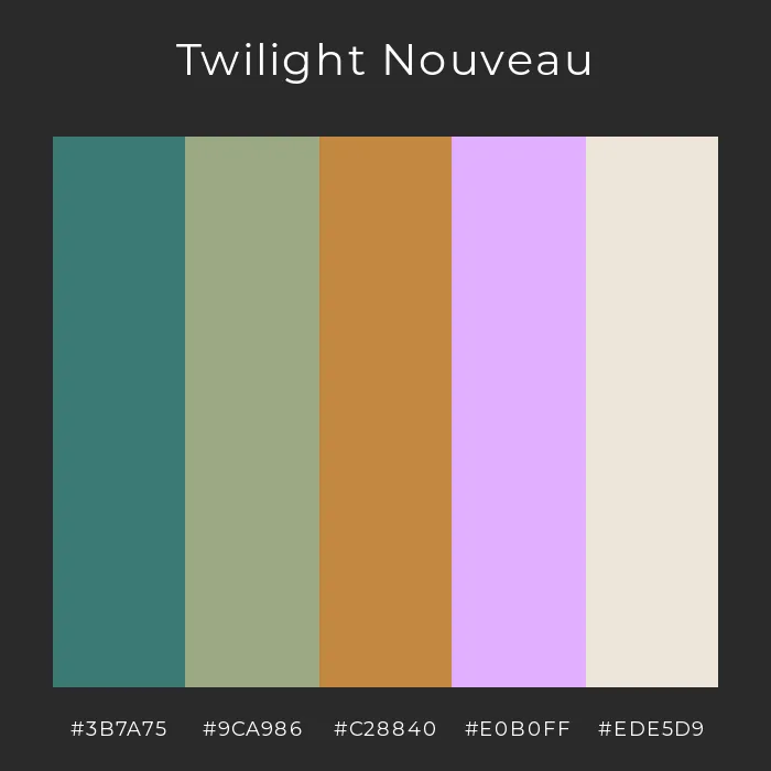
Frequently Asked Questions

Which AI social media post generator works best across multiple platforms? Hootsuite offers the most comprehensive multi-platform support, with AI features optimized for seven major social networks. For content creation specifically, Jasper AI provides templates tailored to each platform’s unique requirements and audience expectations.

Do AI-generated social media posts need human editing? While AI quality has improved dramatically, most professionals recommend reviewing AI-generated content before posting. Tools like Mew Design allow natural language refinements, making the editing process much more efficient than starting from scratch.

Are free AI social media post generators worth using? Free tiers from reputable platforms like Copy.ai and Rytr provide valuable functionality for individuals and small businesses getting started with AI. However, paid versions offer significantly more capabilities, higher quality output, and better consistency for serious marketing efforts.

How can I ensure AI-generated content matches my brand voice? Most advanced AI social media post generators now include voice training features. Jasper AI’s tone analyzer can study your existing content to match your style, while Mew Design allows specific guidance on visual brand elements through natural language instructions.

Will social media platforms penalize AI-generated content? Major platforms have not implemented specific penalties for AI content, but they do prioritize authentic engagement. The best practice is to use AI as a starting point or efficiency tool rather than publishing completely unedited AI content, ensuring your posts maintain human creativity and relevance.

🚀

Ready to Transform Your Social Media Strategy?

Start creating professional-quality social media content with AI-powered design tools. Join thousands of marketers and creators who are already using AI to boost their social media engagement.

Start Creating for Free