Skip to content

Blog

What Is Pop Art Style: A Full Guide to the Pop Art Graphic Design

pop art design style infograhic

Infographic of Pop Art Design Style. Generated using mew.design.

What Is Pop Art Style

Imagine a can of soup, a comic book panel, or the face of Marilyn Monroe transformed into a work of art. This celebration of the everyday, the commercial, and the mainstream is the vibrant and witty world of Pop Art.

The Pop Art style exploded onto the scene in the mid-20th century, challenging the very definition of “art” by embracing the bold, graphic visual language of advertising and mass media. It was fun, accessible, and unapologetically commercial. While its pioneers relied on techniques like screen printing, modern tools—including AI design agents like Mew Design—now let you create graphics with the iconic, high-impact look of this style in seconds, no design experience required.

As one of the most recognizable and enjoyable graphic design styles in our ultimate guide, understanding Pop Art is essential for any designer looking to create work that is eye-catching, energetic, and culturally relevant. This article explores its revolutionary origins, its key visual traits, and its enduring legacy in branding and design.

The Origins of Pop Art: Finding Art in the Everyday

The Pop Art movement emerged in the United Kingdom in the mid-1950s but truly exploded in the United States in the 1960s. It was a direct reaction against the serious, introspective, and often elitist world of Abstract Expressionism, which was the dominant art form at the time.

A new generation of artists looked at the world around them—a booming post-war landscape filled with television, advertisements, Hollywood celebrities, and supermarket shelves—and decided that this mass-produced visual culture was just as worthy of artistic exploration. This 1960s art movement didn’t just borrow from popular culture; it celebrated it, blurring the lines between “high art” and “low art” forever.

The Visual Hallmarks: Key Characteristics of Pop Art Graphic Design

To identify the what is Pop Art style, look for visuals that are bold, graphic, and unapologetically commercial. The aesthetic is clean, confident, and designed to grab your attention immediately.

1. Pop Art Typography: Bold, Playful, and Commercial

Pop Art typography often mimics the lettering seen in advertisements or comic books. It’s typically bold, clean, and integrated directly into the image. Artists often used playful, headline-style fonts or incorporated text as part of a speech bubble, directly referencing the commercial source material.

bold pop art typography

Bold, playful typography inspired by comic books and commercial ads, with headline-style fonts and integrated text bubbles. Generated using mew.design.

2. Pop Art Color Palette: Bright, Saturated, and Unrealistic

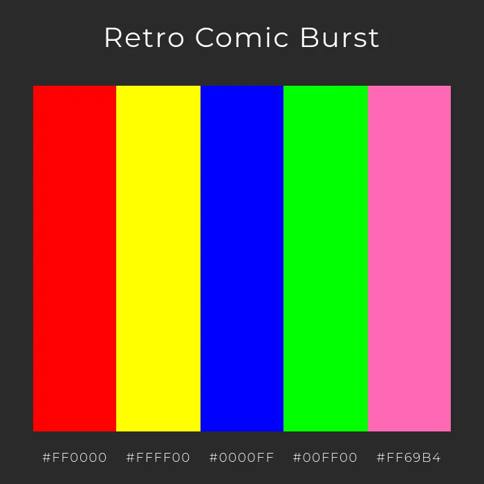
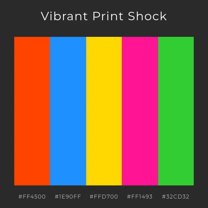
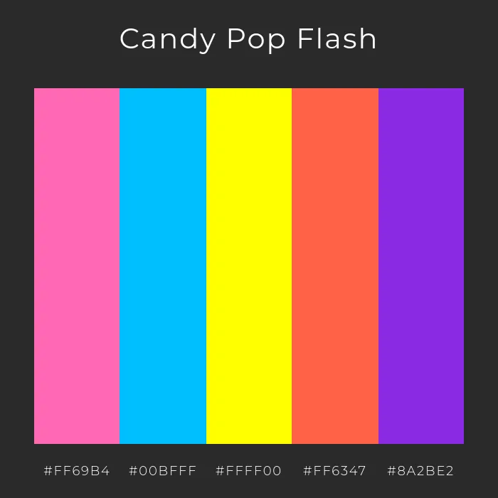
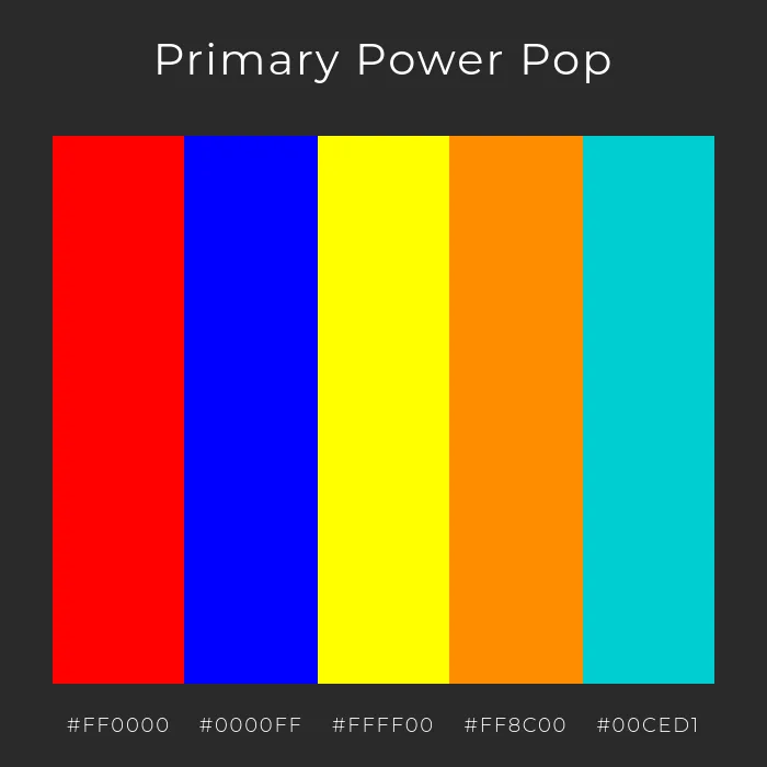
The Pop Art color palette is one of its most defining features. It uses bright, vibrant, and highly saturated colors that are often non-naturalistic. Think bold primary colors—vibrant reds, yellows, and blues—used in flat, unblended blocks. The colors are meant to be eye-catching and mimic the look of commercial printing.

retro comic pop palette

Retro Comic Burst Pop Art Color Palette – bold primaries with neon accents for a playful comic-book feel. Generated using mew.design.

vibrant pop art color palette

Vibrant Print Shock Pop Art Color Palette – high-impact tones inspired by vintage commercial printing. Generated using mew.design.

candy pop art palette

Candy Pop Flash Pop Art Color Palette – sweet candy shades create a surreal and fun visual punch. Generated using mew.design.

neon ad pop color palette

Neon Ad Icons Pop Art Color Palette – electric neon shades evoke vintage signage and urban pop culture. Generated using mew.design.

primary power pop color palette

Primary Power Pop Pop Art Color Palette – classic primaries with vibrant modern accents for bold impact. Generated using mew.design.

warhol pop colors palette

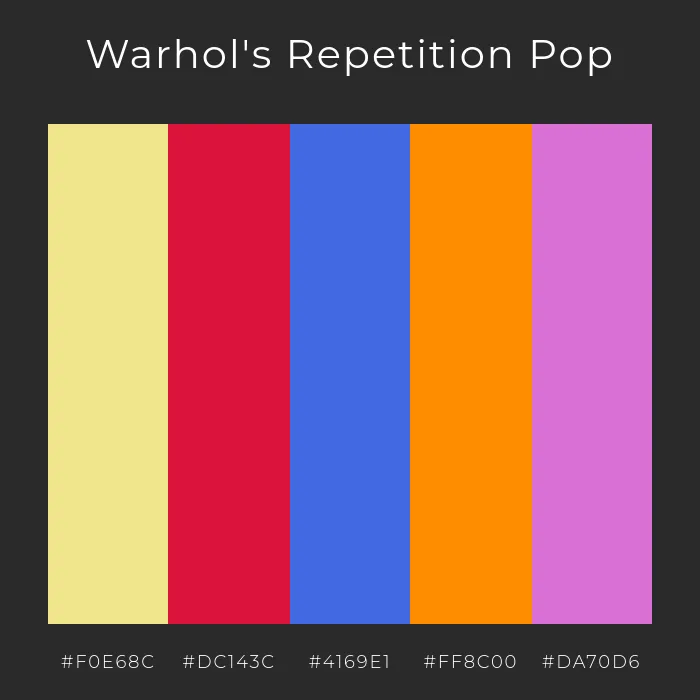
Warhol’s Repetition Pop Art Color Palette – soft khaki contrasts with bold reds and purples for a mass-media effect. Generated using mew.design.

3. Pop Art Layout & Composition: Central and Repetitive

Pop Art compositions are usually direct and easy to read. A single, iconic subject—like a product or a face—is often placed centrally. One of the key compositional techniques is repetition. By showing the same image over and over again (sometimes with color variations), artists like Andy Warhol mimicked the feeling of mass production and mass media.

pop art repetitive layout

Central and repetitive Pop Art layout showcasing an iconic product in a grid format, mimicking mass production aesthetics. Generated using mew.design.

4. Pop Art Imagery & Motifs: The Icons of Mass Culture

The imagery of Pop Art is its most radical element. Artists appropriated and recontextualized everyday visuals:

  • Commercial Products: Soup cans, Coca-Cola bottles, Brillo boxes.
  • Celebrity Portraits: Famous faces like Marilyn Monroe and Elvis Presley.
  • Comic Strips: Roy Lichtenstein famously isolated and enlarged single comic book panels.
  • Ben-Day Dots: To mimic the look of commercial printing, artists used patterns of dots (Ben-Day dots design) to create color and shading.

pop art icons collage

A collage of Pop Art motifs including celebrity portraits, comic panels, and commercial products with halftone dot effects. Generated using mew.design.

Pop Art Graphic Designers and Master Artists

Pop Art was defined by a few key figures whose distinct styles became globally recognized and synonymous with the movement itself.

1. Andy Warhol

The undisputed king of Pop Art graphic design, Warhol’s work explored the relationship between artistic expression, celebrity culture, and advertising. He famously used the commercial technique of silk-screen printing to mass-produce his art.

  • Key Work: His Campbell’s Soup Cans (1962) and Marilyn Diptych (1962) are perfect examples of the Andy Warhol style, transforming mundane objects and celebrity photos into high art.

andy warhol campbell's soup cans 1962

Andy Warhol - Campbell’s Soup Cans, 1962. Source: moma.org

andy warhol Marilyn diptych 1962

Andy Warhol – Marilyn Diptych, 1962. Source: smarthistory.org

2. Roy Lichtenstein

Lichtenstein developed a highly distinctive style by recreating comic book panels on a massive scale. His work was a commentary on how mass media portrayed dramatic themes like love and war.

  • Key Work: Paintings like Whaam! (1963) and Drowning Girl (1963) are iconic examples of his style, complete with bold black outlines, primary colors, and his signature use of Roy Lichtenstein dots.

roy lichentenstein whaam 1963

Roy Lichtenstein - Whaam!, 1963. Source: wikiart.org

roy lichtenstein drowning girl 1963

Roy Lichtenstein - Drowning Girl, 1963. Source: moma.org

3. Richard Hamilton

Often considered the “father of British Pop Art,” Richard Hamilton was a pioneer whose work predated many of his American counterparts. He was a master of collage, using images cut from magazines to critique consumer culture and the saturation of post-war advertising.

  • Key Work: His small but hugely influential collage, Just what is it that makes today’s homes so different, so appealing? (1956), is a foundational piece of the Pop Art movement, defining its themes with wit and complexity.

richard Hamilton just what is it that makes today’s homes so different, so appealing? 1957

Richard Hamilton - Just what is it that makes today’s homes so different, so appealing?, 1956. Source: metmuseum.org

4. Jasper Johns

A pivotal American artist, Jasper Johns is celebrated for creating the bridge between Abstract Expressionism and Pop Art. He focused on “things the mind already knows,” taking familiar symbols like flags, targets, and numbers and rendering them as rich, textured paintings. His use of encaustic (a wax-based paint) gave his subjects a unique sculptural quality.

  • Key Work: Flag (1954-55) is one of the most famous Pop Art examples. It challenged viewers to reconsider a common object as a complex work of art, questioning the lines between symbol and subject.

jasper johns flag 1954-55

Jasper Johns - Flag, 1954-55. Source: moma.org

Pop Art in the Modern World: Contemporary Applications

The bold, accessible, and energetic principles of modern Pop Art have never gone out of style. Its influence is everywhere in contemporary visual culture.

  • Advertising & Branding: Pop Art branding is perfect for brands that want to feel fun, energetic, and approachable. The use of bold colors and graphic shapes helps products stand out on a crowded shelf or in a social media feed.
  • Illustration & Editorial Design: The Pop Art style is frequently used in magazines and web articles to create dynamic and eye-catching illustrations that simplify complex topics.
  • Fashion & Merchandise: The fusion of art and commerce is perfect for fashion collaborations, T-shirts, and other merchandise that uses pop culture imagery.

pop art in modern graphic design

Mood board featuring modern Pop Art applications in branding, web design, and fashion merchandise. Generated using mew.design.

How To Create a Pop Art-Style Graphic Design With AI

Ready to make your designs pop? Mew Design can help you create bold, graphic visuals that capture the fun and energy of the Pop Art movement.

Mew Design is an AI design agent that makes Pop Art design creation simple and effective. It combines accurate text rendering, professional layout control, and editable outputs—so your poster, flyer, advertisement, or social post isn’t just colorful, but also clean and print-ready.

Key Features for Pop Art Graphic Design Projects:

  • Crisp text handling—no warped letters.
  • Editable layouts for flexible adjustments.
  • Style-aware rendering to capture comic-like halftones, bold outlines, and bright contrasts.
  • Export-ready files for both digital and print use.
  • Asset uploads — easily add product photos, reference images, logos, or icons into your design.

A Step-by-Step Prompt Guide

  1. Sign Up or Log In: Visit Mew.Design and create an account or log in to start your project.

    mew design ai design agent

  2. Craft Your Prompt and Generate: Describe your Pop Art design clearly.

    Example: Create a Pop Art poster advertising a sneaker sale. Use comic-style halftone dots, bold red, yellow, and blue colors, and thick black outlines. Add the headline “WOW SALE!” in large bubble letters at the center and smaller text below: “Up to 70% Off – Limited Time Only!”. Feature a pair of high-top sneakers illustrated in a Pop Art style, with a comic explosion background.

    enter your ai pop art style design prompt

  3. Refine with Follow-Up Prompts: Adjust colors, text placement, or visual intensity. For example:

    Make the halftone dots larger or move the headline higher and add a comic-style explosion background.

    edit the ai generated pop art graphic design

  4. Export or Share: Download your poster in high resolution or share it on the Mew Design Community to showcase your work.

🚀

Ready to Make Your Designs Pop?

Whether you’re creating a bold ad campaign, eye-catching social media content, or a fun event poster, Mew Design helps you produce professional graphics that capture the vibrant spirit of Pop Art.

Try Mew Design for Free

Conclusion

Pop Art was a democratic movement that tore down the walls between the gallery and the grocery store. It proved that art could be fun, accessible, and found in the most unexpected places. Its legacy is a reminder to designers to find inspiration in the world around them and to never underestimate the power of a bold, simple, and culturally relevant idea.

Now that you’ve explored the commercial cool of Pop Art, see how designers rebelled against all forms of order with the Postmodernism movement in our Ultimate Guide to Graphic Design Styles.

What Is Postmodernism: A Full Guide to the Postmodern Graphic Design

postmodernism graphic design infograhic

Infographic of Postmodernism Graphic Design Style. Generated using mew.design.

What Is Postmodernism

Imagine a design world where the rigid, clean grid of modernism is suddenly shattered. Where typography is expressive and playful, not just functional. Where mixing historical styles, bold colors, and chaotic layers isn’t a mistake—it’s the entire point. This is the energetic, eclectic, and liberating world of Postmodernism.

The postmodern graphic design style was a direct, often witty, rebellion against the strict, “less is more” philosophy that had dominated design for decades. It declared that design could be complex, personal, and fun again. While its pioneers deconstructed layouts by hand and with early digital tools, today’s AI design tools like Mew Design allow you to generate graphics that capture the expressive and rule-breaking spirit of the postmodern design style in seconds.

As one of the most intellectually playful graphic design styles in our ultimate guide, understanding Postmodernism is key for any designer who wants to challenge conventions and create work with personality. This article explores its rebellious origins, its key characteristics, and its lasting impact on contemporary design.

The Origins of Postmodernism: A Rebellion Against “Good Design”

The Postmodernism graphic design movement began to take shape in the late 1970s and exploded throughout the 1980s. It was a spirited backlash against the rigid, universalist doctrines of Modernism and the Swiss Style. A new generation of designers felt that the modernist mantra of “form follows function” had become sterile, corporate, and restrictive.

Influenced by postmodern philosophy, which questioned universal truths and embraced complexity and contradiction, designers began to intentionally break the rules. They created work that was layered with meaning, historical references, and a healthy dose of irony, bringing personality and expression back to the forefront of design.

postmodern graphic design origins collage

Collage showcasing early Postmodernism design with layered typography, eclectic patterns, and bold rule-breaking compositions from the late 1970s–1980s. Generated using mew.design.

The Visual Hallmarks: Key Characteristics of Postmodernism Graphic Design

To identify the postmodern design, look for complexity, eclecticism, and a deliberate rejection of order and simplicity. The aesthetic is often described as a “controlled chaos.”

1. Postmodernism Typography: Expressive and Deconstructed

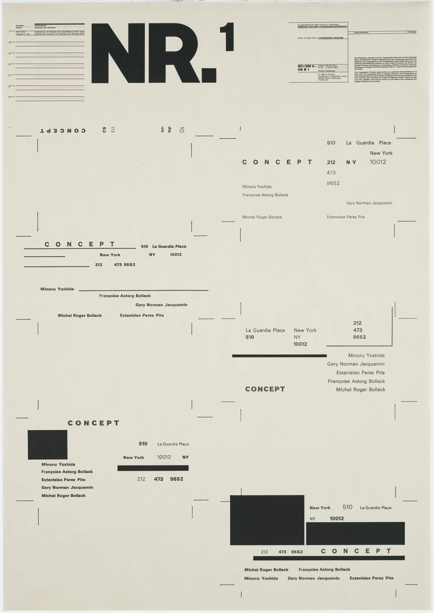
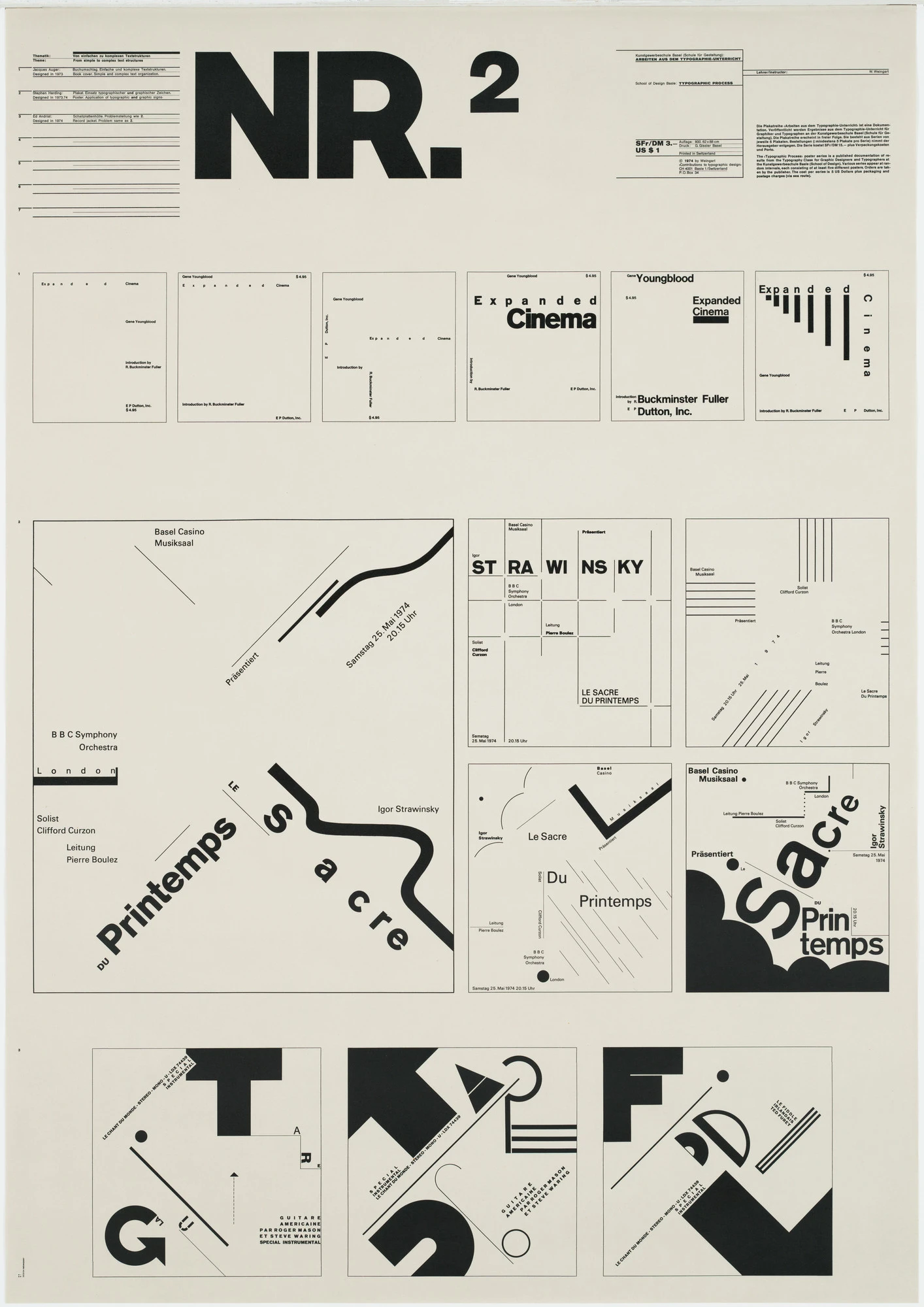
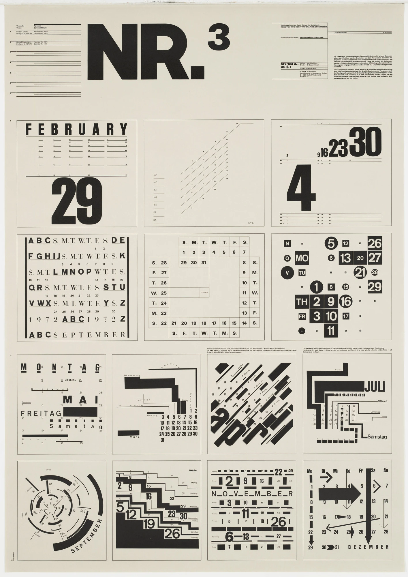
Wolfgang Weingart’s typography experiments are a cornerstone of the style. Postmodern typography is expressive and often deconstructed. Designers would mix different fonts, weights, and styles, play with letter spacing, and shatter text into abstract shapes. Legibility was often challenged in favor of creating an emotional or visual impact.

expressive and deconstructed typography in postmodern graphic design

Postmodern typography experiments with form, mixing fonts and deconstructing letters to create visual impact over legibility. Generated using mew.design.

2. Postmodernism Color Palette: Bold, Clashing, and Playful

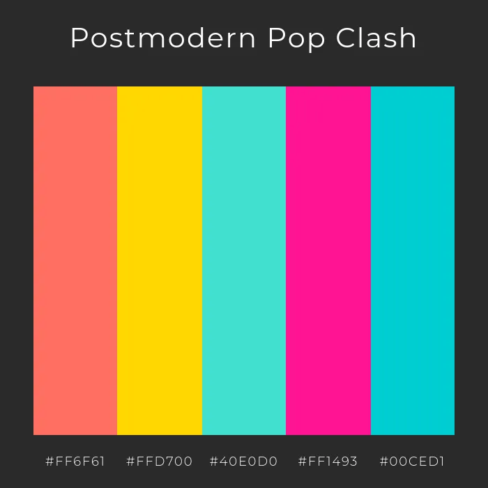
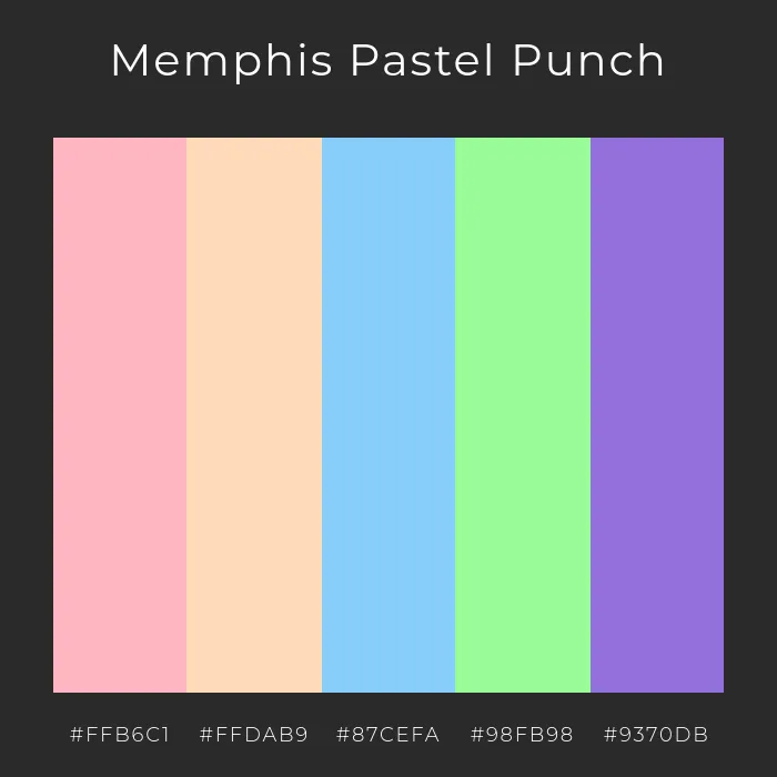
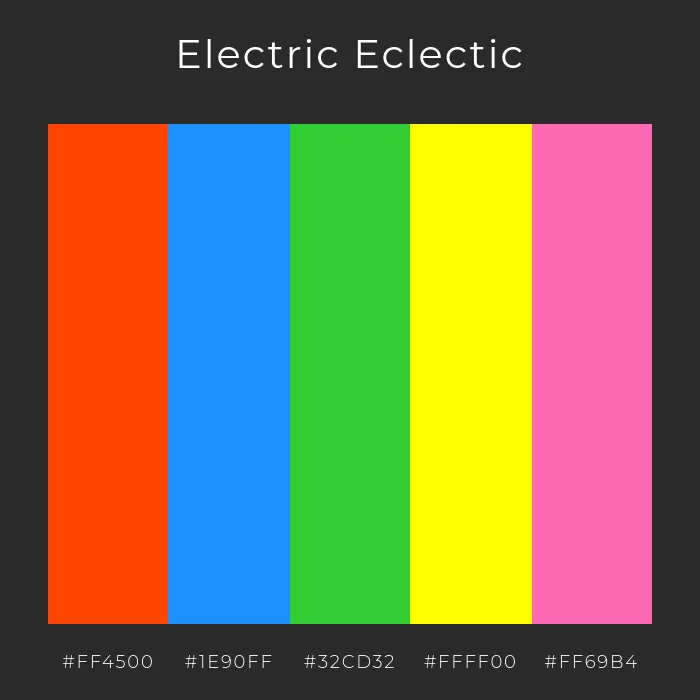
The Postmodern color palette is fearless. It often features bright, highly saturated, and sometimes clashing colors. The Italian design collective, the Memphis Group, famously used a palette of vibrant pastels and primary colors in unconventional combinations, a hallmark of 80s graphic design trends.

postmodern pop clash color palette

Postmodern Pop Clash uses daring hues and clashing tones to reflect Memphis Group aesthetics and playful 80s design energy. Generated using mew.design.

postmodern memphis pastel color palette

Memphis Pastel Punch combines soft pastels with vibrant contrasts—signature Postmodern design color play. Generated using mew.design.

postmodern eclectic bright color palette

Electric Eclectic celebrates bold saturation and high-contrast combinations for true Postmodern impact. Generated using mew.design.

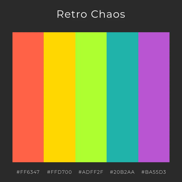
retro postmodern color palette

Retro Chaos channels 80s Memphis-style color freedom with fearless juxtapositions and lively tones. Generated using mew.design.

3. Postmodernism Layout & Composition: Breaking the Grid

The most fundamental act of Postmodernism was to break the grid that the Swiss Style had held sacred. Layouts are often layered, asymmetrical, and feel chaotic. Elements float, overlap, and are placed at odd angles, creating a sense of dynamic, deconstructed energy.

asymmetrical and layered layout in postmodern design

Editorial spread in Postmodern design style, where images and text blocks overlap at odd angles, some tilted, some floating. Generated using mew.design.

4. Postmodernism Imagery & Motifs: Eclectic and Collage-Like

Postmodernism loves to mix and match. Imagery is often eclectic, combining historical references with modern elements, or high art with low-brow culture.

  • Collage: Combining different textures, photos, and illustrations is a common technique.
  • Geometric Shapes: The Memphis Group design style introduced playful, abstract geometric shapes and squiggly patterns.
  • Historical Pastiche: Appropriating and recontextualizing older art and design styles in a new, often ironic, way.

postmodernism iconic collage aesthetic

Eclectic imagery, historical references, and Memphis-style motifs create Postmodernism’s iconic collage aesthetic. Generated using mew.design.

Postmodern Graphic Designers and Master Artists

Postmodernism was championed by designers who felt constrained by modernism’s rules and sought new avenues for personal expression and experimentation.

1. Wolfgang Weingart

Often called the “father” of New Wave or Postmodern typography, Weingart was a Swiss designer and teacher who encouraged his students to stretch, bend, and break the rules of Swiss Style typography. His layered, experimental work was highly influential.

  • Key Work: His experimental posters from the 1970s and 80s, which feature complex layers of text and texture, redefined what typography could be.
Wolfgang Weingart Typographic Process, Nr 1. Organized Text Structures

Wolfgang Weingart - Typographic Process, Nr 1. Organized Text Structures, 1974. Source: moma.org

Wolfgang Weingart - Typographic Process, Nr 2. From Simple to Complex, 1973

Wolfgang Weingart - Typographic Process, Nr 2. From Simple to Complex, 1973. Source: moma.org

Wolfgang Weingart - Typographic Process, Nr 3. Calender Text Structures, 1971-1972

Wolfgang Weingart - Typographic Process, Nr 3. Calender Text Structures, 1971-1972. Source: moma.org

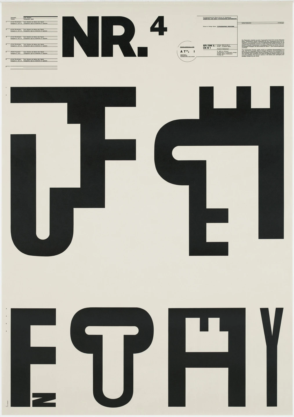
Wolfgang Weingart - Typographic Process, Nr 4. Typographic Signs, 1971-1972

Wolfgang Weingart - Typographic Process, Nr 4. Typographic Signs, 1971-1972. Source: moma.org

Wolfgang Weingart - Typographic Process, Nr 5. Typography as (Painting), 1971-1974

Wolfgang Weingart - Typographic Process, Nr 5. Typography as (Painting), 1971-1974. Source: moma.org

2. April Greiman

An American designer and a pioneer of digital art, Greiman was one of the first to embrace the computer as a design tool. She used early Macintosh computers and software to create a new visual language of layered, pixelated, and deconstructed digital imagery.

  • Key Work: Her 1986 issue of Design Quarterly, a life-sized, digitally-collaged self-portrait poster, was a landmark moment for digital design.

april greiman design quarterly #13 does it make sense

April Greiman - ‘does it make sense?’ Design Quarterly #113, 1986. Source: aprilgreiman.com

3. Paula Scher

A legendary American designer, Scher’s work often embodies a Postmodern spirit, particularly her iconic, type-driven posters for The Public Theater in New York. She uses typography as a powerful, expressive, and often playful tool for visual identity.

  • Key Work: Her posters for The Public Theater, with their bold, street-style typography, are instantly recognizable and have become an iconic part of New York’s cultural landscape.

paula scher the public theater 95-96 season

Paula Scher - The Public Theater, 95-96 Season, 1995. Source: moma.com

Postmodernism in the Modern World: Contemporary Applications

The rule-breaking spirit of modern Postmodernism is alive and well, especially in creative fields that value individuality and expression over corporate uniformity.

  • Zine Culture & Independent Publishing: The DIY, layered, and eclectic aesthetic of Postmodernism is a perfect match for independent magazines and zines.
  • Experimental Web Design: While mainstream web design favors usability, more artistic and experimental sites often embrace Postmodern principles like broken grids and deconstructed text.
  • Branding for Creative Industries: Brands in music, fashion, and art often use Postmodern aesthetics to appear bold, unconventional, and culturally aware.

modern Postmodernism design examples

Mood board of modern Postmodernism: zine cover, experimental web design, and indie music branding showing eclectic and expressive style. Generated using mew.design.

How To Create a Postmodern-Style Design With AI

Ready to break the grid and create something truly expressive? Mew Design can help you channel the controlled chaos of Postmodernism.

mew design ai design agent

Mew Design is an AI design agent that makes it easy to explore the eclectic nature of Postmodern style without getting lost in the details.

  • Crisp text rendering — even when distorted or angled.
  • Editable layouts — perfect for mixing unexpected design elements.
  • Style-aware rendering — captures vibrant colors, collage effects, and bold contrasts.
  • Asset uploads — include patterns, photos, or illustrations to layer into your composition.
  • Export-ready files — ideal for web, social, or print.

A Step-by-Step Prompt Guide

Step 1 – Sign Up or Log In

Create a free account or log in to Mew Design to start building your Postmodern design.

Step 2 – Enter Your Prompt and Generate

Write a descriptive prompt highlighting key Postmodern traits—collage, playful typography, and a mix of retro and futuristic elements.

Example Prompt: Create a Postmodern-style zine cover titled ‘Urban Chaos’. Use clashing colors—neon pink, acid green, and electric blue—with layered cut-and-paste textures and bold, misaligned typography. Add a small subtitle ‘Issue 01 | Summer 2025’ at the bottom right corner. Include a collage of city fragments and abstract patterns.

enter your ai postmodern graphic design prompt

Step 3 – Refine Using Follow-Up Prompts

Adjust typography placement, tweak colors, or rearrange graphic elements without losing the original style.

Example Follow-up Prompts: Make the subtitle ‘Issue 01 | Summer 2025’ a bit larger. Or, overlap the headline with one of the geometric shapes.

edit the ai generated postmodern graphic design with prompt

Step 4 – Export or Share

Download your final design in high resolution or share it directly to Mew Design’s showcase community.

🚀

Ready to Create a Postmodern Graphic Design?

Whether you’re designing an event poster, a magazine cover, or a bold social media graphic, Mew Design helps you produce professional designs that capture the expressive freedom of Postmodernism.

Try Mew Design for Free

Conclusion

Postmodernism gave designers permission to be playful, expressive, and even illogical again. It shattered the rigid dogma of modernism and opened the door to a world of infinite stylistic possibilities. Its legacy is the understanding that there is no single “correct” way to design, and that sometimes, the most interesting work comes from breaking the rules.

Now that you’ve explored the eclectic chaos of Postmodernism, see how its opposite—extreme simplicity—is expressed in Minimalism in our Ultimate Guide to Graphic Design Styles.

Mid-Century Modern Graphic Design: A Guide to 1950s Optimism & Charm

mid century modern style infograhic

Infographic of Mid-Century Modern Style. Generated using mew.design.

What Is Mid-Century Modern Style

Imagine the playful opening credits of a classic Hitchcock film, the friendly, colorful illustrations in a 1950s children’s book, or the iconic, minimalist shell of an Eames chair. This world of charming characters, organic shapes, and boundless optimism is the heart of the Mid-Century Modern style.

Mid-Century Modern was the friendly, accessible face of modernism, capturing the spirit of a post-war world brimming with confidence and excitement for the future. While its masters once brought character to life with ink and paper, today you can use AI design tools like Mew Design to create graphics that capture the unique retro charm of the Mid-Century Modern style.

As one of the most beloved and enduring graphic design styles in our ultimate guide, understanding Mid-Century Modern is key for any designer looking to create work that feels friendly, nostalgic, and full of character. This article explores its optimistic origins, its key visual traits, and its lasting appeal in modern branding.

The Origins of Mid-Century Modern: Designing for an Optimistic Future

The Mid-Century Modern graphic design style flourished in the United States from roughly 1945 to 1965. In the prosperous years following World War II, a sense of optimism and excitement swept the nation. Families were moving to the suburbs, consumer culture was booming, and there was a widespread fascination with the future, space exploration, and the “atomic age.” This retro design style captured that mood perfectly. It moved away from the rigid formalism of European modernism and embraced a warmer, more playful, and organic approach that was perfectly suited for advertising, publishing, and the new medium of television.

mid century modern tv ad poster

A colorful 1950s TV advertisement poster with bold typography and futuristic flair. Generated using mew.design.

The Visual Hallmarks: Key Characteristics of Mid-Century Modern Graphic Design

To identify the what is Mid-Century Modern style, look for a unique blend of clean modern lines and playful, organic charm. It’s a style that feels both simple and full of personality.

1. Mid-Century Modern Typography: Friendly and Expressive

Mid-Century Modern typography is often clean and legible, but with a touch of personality. While sans-serif fonts were common, they were often used in playful ways—staggered, bounced along a baseline, or mixed with friendly, informal script fonts. The goal was approachability rather than cold neutrality.

2. Mid-Century Modern Color Palette: Bright and Contrasting

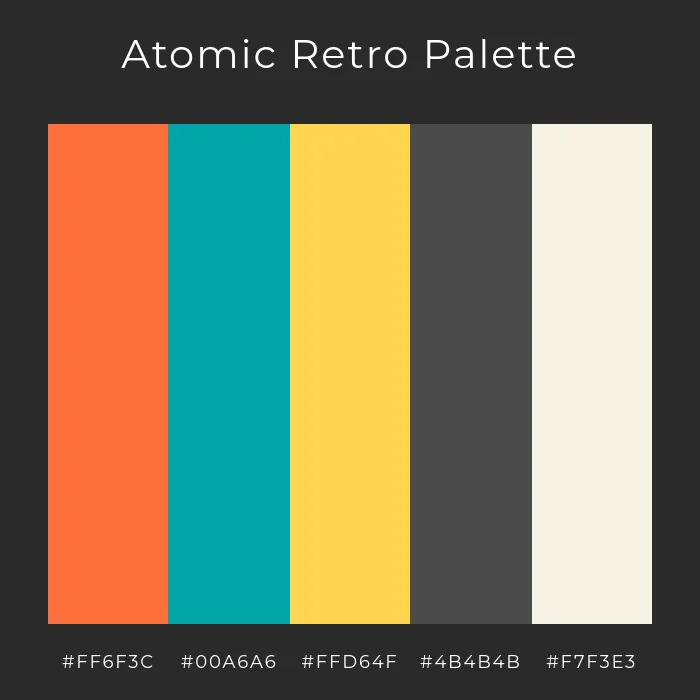
The Mid-Century Modern color palette is one of its most defining features. It’s known for its bright and optimistic hues, often pairing vibrant colors like atomic orange, turquoise, and sunny yellow with deep, earthy tones like olive green, brown, and charcoal gray for a signature high-contrast look.

mid century modern atomic retro colors

A bold and vibrant Mid-Century Modern color palette featuring atomic orange, turquoise, and deep charcoal for striking retro appeal. Generated using mew.design.

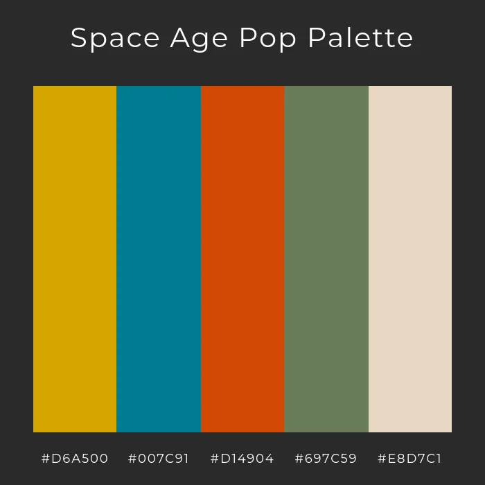
space age pop retro color palette

Inspired by the optimism of the Jet Age, this Mid-Century Modern color palette blends golden tones, teal, and earthy greens. Generated using mew.design.

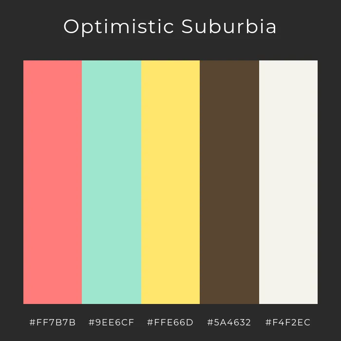
mid century suburban retro color palette

Reflecting the cheerful spirit of 1950s suburbia, this Mid-Century Modern palette pairs soft pastels with warm earthy hues. Generated using mew.design.

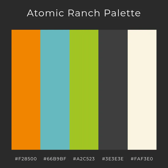
atomic ranch mid century modern colors

A sophisticated Mid-Century Modern palette inspired by vintage ranch homes, mixing vibrant orange and teal with muted neutrals. Generated using mew.design.

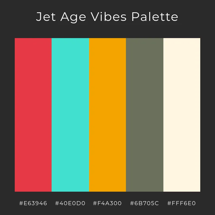
jet age retro color swatches

A high-energy Mid-Century Modern palette that captures the sleek optimism of the Jet Age with red, turquoise, and golden hues. Generated using mew.design.

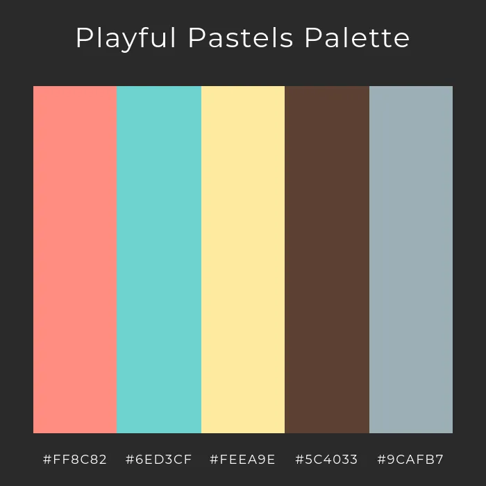
mid century modern pastel color palette

A softer take on Mid-Century Modern design, using pastel pink, teal, and yellow for a playful yet refined retro look. Generated using mew.design.

3. Mid-Century Modern Layout & Composition: Asymmetrical yet Balanced

Unlike the strict symmetry of earlier styles, the layouts of Mid-Century Modern graphic design are typically asymmetrical. However, they are always carefully balanced, using the size, color, and placement of elements to create a composition that feels dynamic and harmonious, but never chaotic.

4. Mid-Century Modern Imagery & Motifs: Playful and Abstract

Mid-Century Modern illustration is the heart of the style. It rejected realism in favor of simple, stylized, and often quirky illustrations. Key elements include:

  • Simple, abstract geometric shapes (like starbursts and boomerangs, reflecting the “atomic age”).
  • Playful, cartoon-like characters with simple features.
  • Organic, free-form shapes that feel spontaneous and lively.

mid century modern book cover design

A playful Mid-Century Modern book cover featuring bold shapes and space-age optimism. Generated using mew.design.

Mid-Century Modern Graphic Designers and Master Artists

The Mid-Century Modern era was defined by legendary American designers who reshaped corporate and entertainment design with their wit and visual intelligence.

1. Paul Rand

A giant of American graphic design, Paul Rand was a master of creating corporate logos that were not only simple and memorable but also full of wit and charm. He believed that a logo’s primary goal was to be a universal symbol, and he used simple, playful forms to achieve this.

  • Key Work: His iconic logos for IBM, UPS, ABC, and Westinghouse are perfect examples of Paul Rand logos that are both modern and deeply personable.

logos designed by paul rand

Some of the logos designed by the MCM graphic designer – Paul Rand. Source: pixartprinting

2. Saul Bass

Saul Bass revolutionized film advertising and title sequence design. He transformed movie openings from a simple list of credits into a short, symbolic film that captured the entire mood of the movie to come.

  • Key Work: His groundbreaking title sequences for films like Anatomy of a Murder, Vertigo, and The Man with the Golden Arm are masterpieces of the Saul Bass posters and motion style, using cut-out shapes and bold typography to create suspense and drama.

anatomy of a murder poster by saul bass

Saul Bass, Anatomy of a Murder poster, 1959. Source: sfmoma.org

Mid-Century Modern Graphic Design in the Modern World: Contemporary Applications

The warmth and charm of Mid-Century Modern make it an incredibly popular choice for contemporary brands looking to feel friendly, trustworthy, and a little nostalgic.

  • Branding & Illustration: Modern MCM branding is a popular choice for tech startups, creative agencies, and direct-to-consumer brands. Its illustrative style helps humanize technology and make brands feel more approachable and authentic.

    mid century modern branding design

    Contemporary brand identity using Mid-Century Modern illustrations, bold typography, and retro shapes for a warm, approachable feel. Generated using mew.design.

  • Packaging: The style’s friendly characters and bright colors make it perfect for a wide range of product packaging, from coffee bags to children’s toys.

    mid century modern packaging design

    Product packaging in Mid-Century Modern style, featuring playful graphics, nostalgic hues, and geometric layouts. Generated using mew.design.

  • Posters & Publishing: It remains a go-to style for book covers, event posters, and editorial illustrations that need a touch of retro charm and character.

    mid century modern poster design

    A vibrant poster and book cover design showcasing Mid-Century Modern’s signature color blocking and retro charm. Generated using mew.design.

How To Create a Mid-Century Modern-Style Design with AI

Want to capture the retro charm and optimism of the 1950s? Mew Design’s AI Design Agent can help you create delightful Mid-Century Modern graphics with ease.

mew design ai design agent

Key Features of Mew Design

  • Flawless Text Rendering – No more broken or misspelled text in your visuals.
  • Editable Layouts – Generate designs you can refine, not just static images.
  • Style-Accurate Outputs – From Mid-Century Modern to Bauhaus, layouts match authentic design principles.
  • Follow-Up Prompt Refinement – Adjust colors, fonts, or composition with quick updates.
  • Creative Community – Share and explore designs from other creators for inspiration.

A Step-by-Step Prompt Guide

  1. Sign Up or Log In to Mew Design: Create a free account or log in to start your project.

  2. Enter Your Prompt and Generate: describe the Mid-Century Graphic design style clearly.

    enter your ai mid century modern graphic design prompt

    Example Prompt: Create a Mid-Century Modern poster. Use muted tones like mustard yellow, teal, and warm gray. Incorporate abstract geometric shapes, clean lines, and sans-serif fonts. Add a bold headline at the top: “Retro Design Night,” with the date “October 18, 2025” below.

  3. Refine Using Follow-Up Prompts: Adjust layout, colors, or typography. You can ask for more texture, different shapes, or a warmer palette to fine-tune the vintage feel.

    edit the ai generated mid century modern graphic with prompt

  4. Export or Publish to the Mew Design Community: Download your finished Mid-Century Modern Graphic design in high resolution or share it directly with the Mew Design community.

    export your ai generated mid century modern style graphic design

🚀

Ready to Design with Retro Charm?

Whether you’re creating a friendly brand mascot, a charming social media post, or a nostalgic event poster, Mew Design helps you produce professional graphics that capture the optimistic spirit of Mid-Century Modern.

Try Mew Design for Free

Conclusion

Mid-Century Modern graphic design proved that modernism didn’t have to be cold or impersonal. By infusing clean lines with character, warmth, and wit, it created a visual language that remains beloved for its optimism and timeless appeal. Its legacy is a reminder that good design can be both smart and friendly.

Now that you’ve explored the playful world of Mid-Century Modern, see how design took a wild turn with the Psychedelic movement of the 1960s in our Ultimate Guide to Graphic Design Styles.

Psychedelic Graphic Design: A Guide to the Mind-Bending Art of the 1960s

psychedelic style infograhic

Infographic of Psychedelic Design Style. Generated using mew.design.

What Is Psychedelic Style

Imagine a poster where the letters themselves seem to melt and dance, where colors vibrate with such intensity they almost hum, and where swirling patterns pull you into a visual vortex. This immersive, rule-breaking, and mind-expanding experience is the world of Psychedelic design.

Born from the epicenter of the 1960s counter-culture, Psychedelic art sought to visually represent the altered states of consciousness induced by psychedelic drugs like LSD. It was a complete rejection of the clean, orderly modernism that preceded it. While its pioneers once used intricate hand-drawing to bring their visions to life, you can now use Mew Design—an AI design agent—to quickly generate graphics that capture the fluid energy of the Psychedelic style.

As one of the most expressive and visually distinct graphic design styles in our ultimate guide, understanding Psychedelia is essential for any designer looking to create work that is immersive, free-spirited, and unforgettable. This article explores its cultural origins, its key visual characteristics, and its vibrant legacy.

The Origins of Psychedelia: The Visual Soundtrack to a Revolution

The Psychedelic graphic design style exploded into life in the mid-1960s, with its epicenters in San Francisco and London. It was the visual arm of the hippie movement art and was inextricably linked to the psychedelic rock music of the era.

Psychedelic Designers were tasked with creating posters for bands like the Grateful Dead, Jefferson Airplane, and Jimi Hendrix, and for events at venues like The Fillmore auditorium.

Heavily influenced by the consciousness-expanding effects of LSD, these Psychedelic artists abandoned the rules of legibility and commercial design, instead aiming to create a total visual experience that mirrored the intensity and fluidity of the music and the psychedelic experience itself.

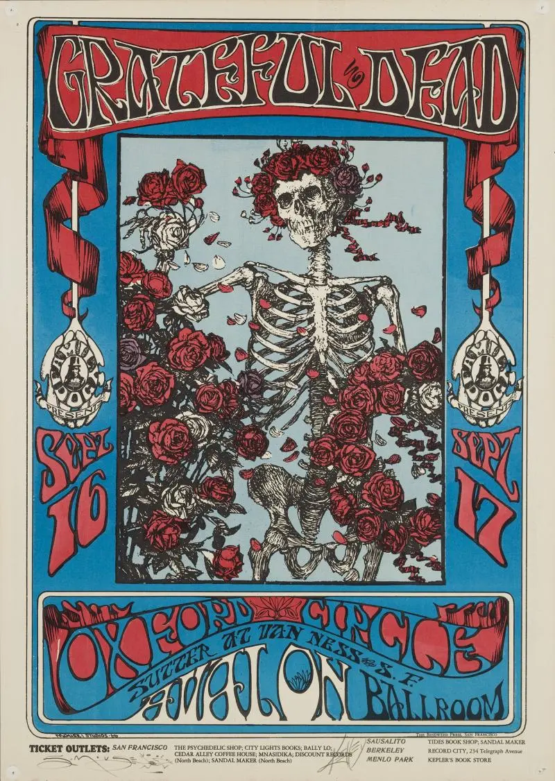
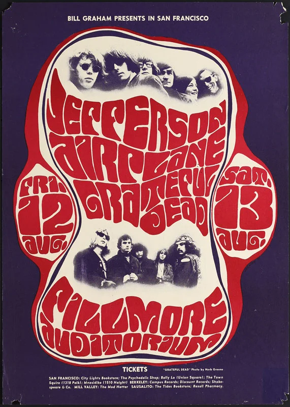
Examples of psychedelic posters for concerts and bands:

grateful dead skull and roses poster

Skull and Roses, Psychedelic Poster for Grateful Dead by Alton Kelley and Stanley Mouse, 1966. Source: denverartmuseum.org

jefferson airplane fillmore poster

Psychedelic Poster for Jefferson Airplane and Grateful Dead by Wes Wilson, 1966. Source: dking-gallery.com

jimi hendrix 1968 flying eyeball concert poster

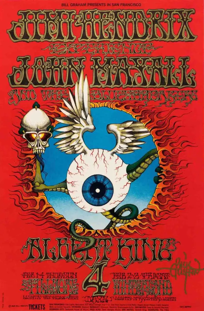
’Flying Eyeball’ concert poster, Psychedelic poster for Jimi Hendrix by Rick Griffin, 1968. Source: finebooksmagazine.com

doors, yard birds - fillmore auditorium psychedelic poster

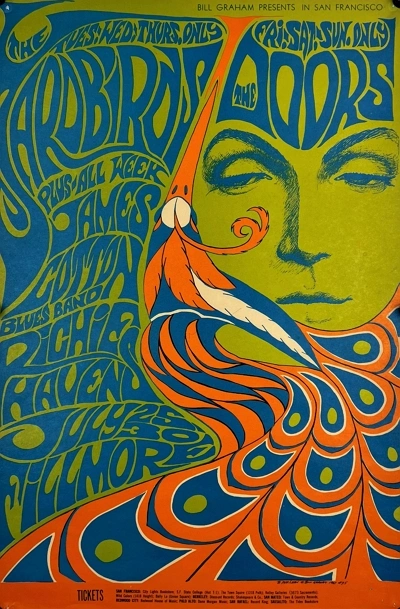
Doors, Yard Birds- Fillmore Auditorium, Psychedelic Poster by Bonnie MacLean, 1967. Source: authenticvintageposters.com.

The Visual Hallmarks: Key Characteristics of Psychedelic Art

To identify the Psychedelic style, look for visuals that are dense, vibrant, and intentionally disorienting. The goal is to overwhelm the senses.

1. Psychedelic Typography: Fluid and Illegible

Psychedelic fonts and lettering are one of the style’s most famous features. Designers like Wes Wilson pioneered a style where letters were warped, stretched, and melted to fill every corner of the page. Legibility was not the main concern; the typography became an abstract, textural element that was part of the overall image, forcing the viewer to “experience” the poster rather than just read it.

psychedelic typography warped lettering

Poster with warped psychedelic lettering that blends text and art. Generated using mew.design.

2. Psychedelic Color Palette: Intense and Vibrating

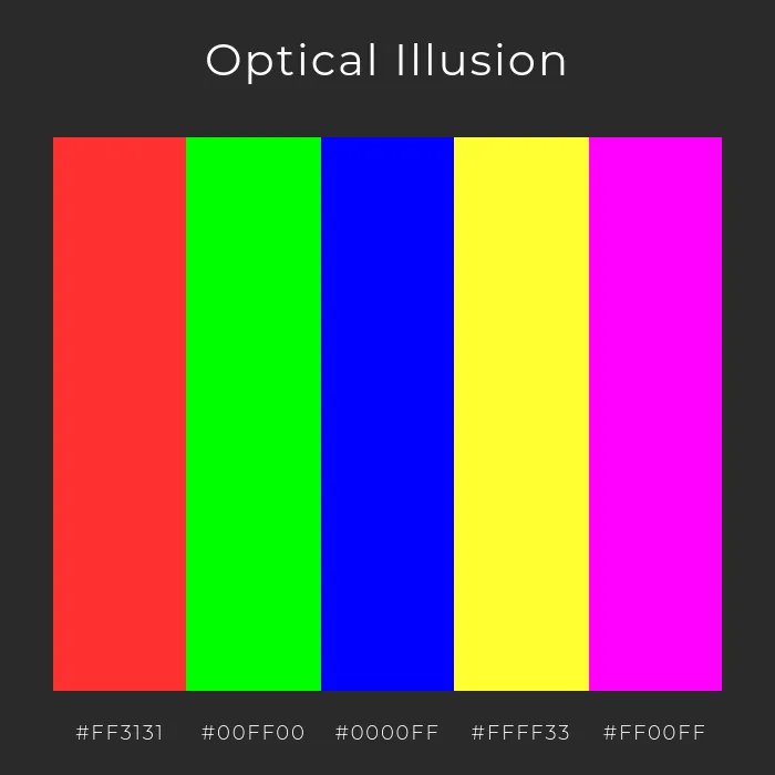
The Psychedelic color palette is defined by its use of high-saturation, high-contrast colors. Artists would place complementary colors (like bright red and green) right next to each other to create an optical effect of vibrating colors, making the design appear to shimmer and move. The palette is electric, jarring, and full of energy.

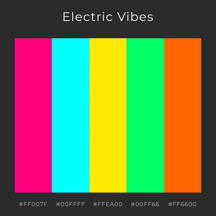
Here are some Psychedelic color palette examples to inspire your graphic design projects:

psychedelic electric color palette

A vibrant mix of neon pink, cyan, and acid green, perfect for high-energy psychedelic posters. Generated using mew.design.

psychedelic optical illusion palette

High-contrast colors that create a vibrating optical illusion effect. Generated using mew.design.

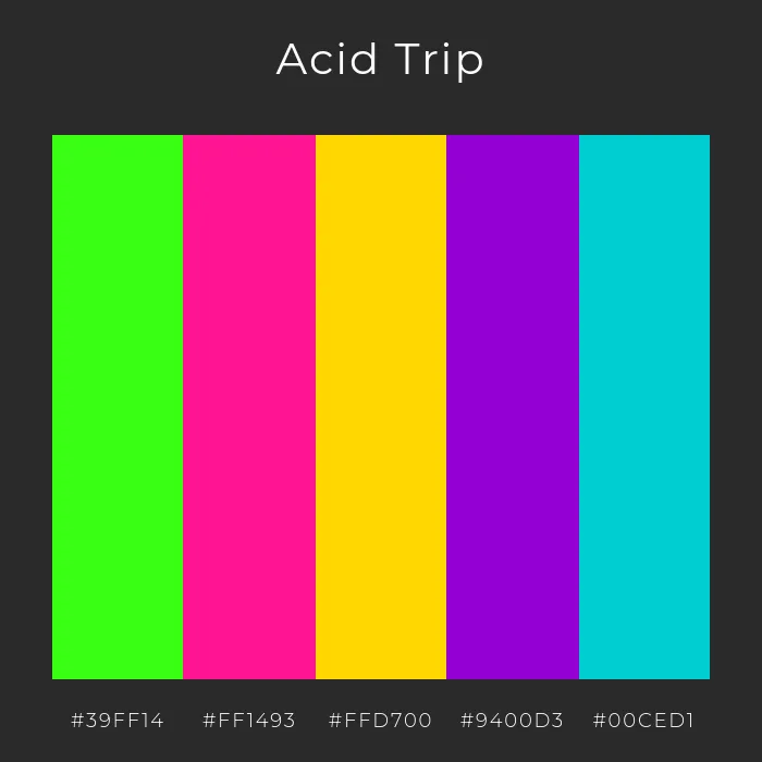
psychedelic acid trip colors

Intense neon hues evoke a sense of surreal movement and hallucinatory energy. Generated using mew.design.

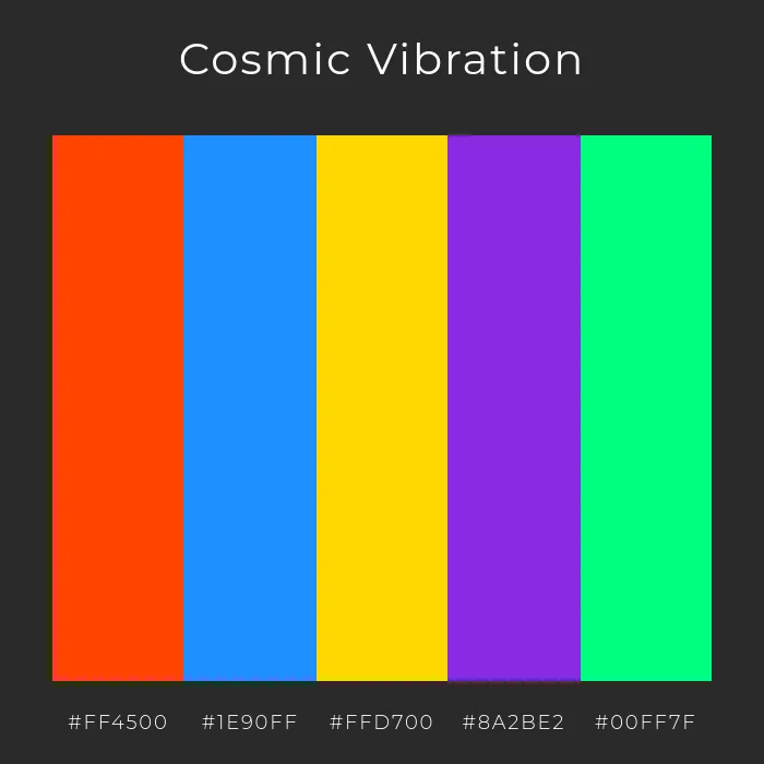
cosmic psychedelic color palette

A bold clash of orange, blue, and purple with electric accents for a cosmic feel. Generated using mew.design.

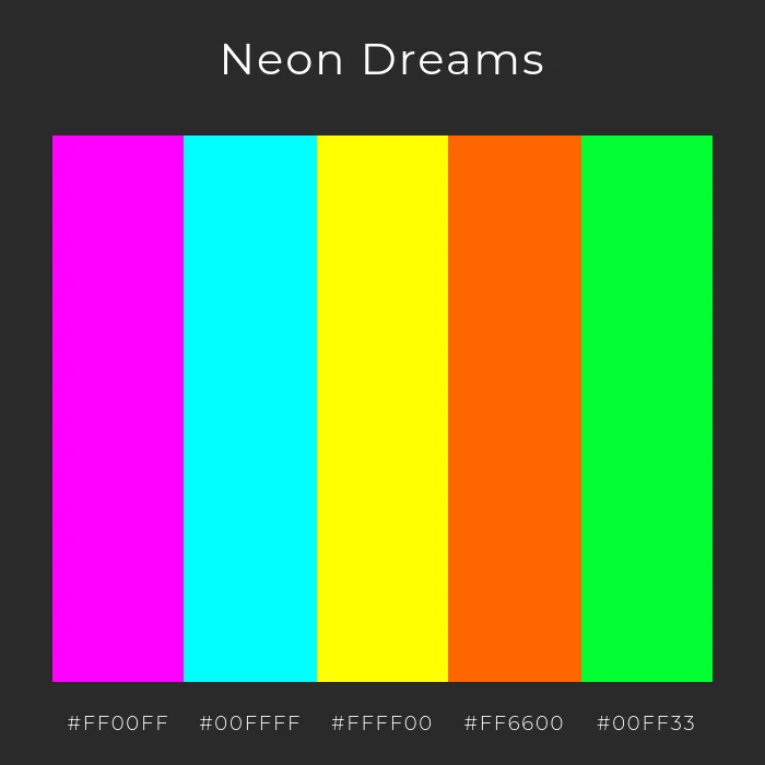
neon psychedelic color palette

A glowing palette of neon magenta, cyan, and yellow that pulses with visual intensity. Generated using mew.design.

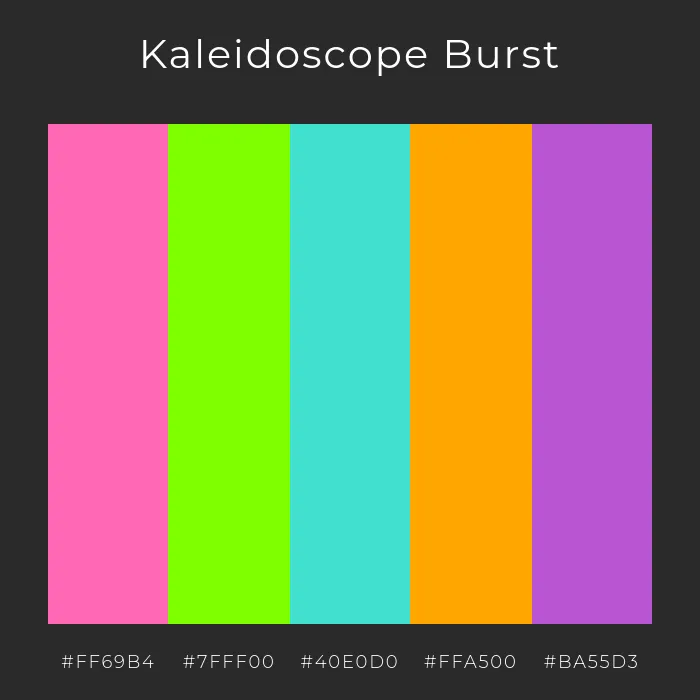
kaleidoscope psychedelic palette

Multiple high-saturation tones combine in a kaleidoscopic, mind-bending explosion of color. Generated using mew.design.

3. Psychedelic Layout & Composition: Horror Vacui (Fear of Empty Space)

Psychedelic design rejects minimalism entirely. Compositions are incredibly dense, with every inch of the page filled with swirling patterns, text, and imagery. There is a clear horror vacui, or fear of empty space. The layout is often a vortex-like swirl that pulls the viewer’s eye towards the center.

dense psychedelic poster design

A chaotic, fully packed composition with swirling patterns and a vortex effect, embodying the horror vacui principle. Generated using mew.design.

4. Psychedelic Imagery & Motifs: Abstract and Surreal

The imagery of Psychedelia is fluid and metamorphic. Common motifs include:

  • Abstract, swirling shapes reminiscent of Art Nouveau (which was a major influence).
  • Paisley patterns, floral motifs, and other decorative, organic forms.
  • Surreal and bizarre collages and illustrations.

Psychedelic Graphic Designers and Master Artists

The Psychedelic style was defined by a small group of highly influential poster artists, primarily based in San Francisco, who created the visual identity for a generation.

1. Wes Wilson

Often called the “father” of the 1960s concert poster, Wilson is credited with inventing and popularizing the signature psychedelic font style. His lettering, which looked like it was melting and moving, became the defining typographic look of the era.
  • Key Work: His posters for The Fillmore, featuring bands like the Grateful Dead and The Association, are quintessential examples of his groundbreaking typographic style.

wes wilson otis rush poster for the fillmore

Otis Rush, Wes Wilson, 1967. Source: sfmoma.org

2. Victor Moscoso

Moscoso was the only one of the main psychedelic artists with formal academic training. He uniquely applied color theory to his work, using vibrating color combinations to create a kinetic, disorienting effect that was scientifically designed to assault the senses.

  • Key Work: His poster series for The Chambers Brothers is a masterclass in the use of vibrating colors, creating posters that are almost impossible to look at statically.

victor moscoso’s poster for the chambers brothers

The Chambers Brothers, Victor Moscoso, 1967. Source: moma.org

3. Rick Griffin

Griffin brought a unique blend of surf culture, hot-rod art, and underground comix (like Zap Comix) to the Psychedelic design. His work is known for its surreal imagery, intricate illustrations, and masterful, often mystical, lettering. He created some of the most iconic and strange characters of the era, most famously the “flying eyeball.”

  • Key Work: His “Flying Eyeball” poster for a Jimi Hendrix concert at The Fillmore is one of the most famous psychedelic posters ever created. He also designed legendary album covers, such as the Grateful Dead’s Aoxomoxoa.

rick griffin’s cover design for grateful dead aoxomoxoa

Album cover for the Grateful Dead, Aoxomoxoa, Rick Griffin, 1969. Source: moma.org

4. Bonnie MacLean

As one of the few prominent female Psychedelic artists, MacLean brought a different sensibility to the Fillmore posters after she took over from Wes Wilson. Her style was heavily influenced by Art Nouveau and medieval art, featuring gothic-style figures, intricate patterns, and a more structured, elegant composition.

  • Key Work: Her posters for The Fillmore, like her famous design for The Doors and The Yardbirds (1967), showcase her distinctive figurative style and beautiful, flowing hand-lettering.

bonnie maclean’s poster for the fillmore - martha and the vandellas

Martha and the Vandellas, Bonnie MacLean, 1967. Source: bahrgallery.com

5. Stanley Mouse & Alton Kelley

This legendary collaborative duo, known as Mouse Studios, perfected the art of collage. Kelley was a master at finding and re-contextualizing historical imagery, often from 19th-century engravings, while Mouse applied his expert airbrushing skills, honed in the world of hot-rod art.

  • Key Work: They are responsible for some of the most enduring imagery in rock history, most notably the Grateful Dead’s “Skull and Roses” logo, which they adapted from an old illustration for the Rubaiyat of Omar Khayyam.

6. Bob Masse

A Canadian Psychedelic artist who was influential in both the San Francisco and Vancouver scenes, Masse is known for his distinct style heavily rooted in the Art Nouveau movement, particularly the work of Alphonse Mucha. His posters often feature stylized female figures, intricate borders, and a clean, elegant aesthetic.

  • Key Work: His prolific work includes posters for nearly every major band of the era, from Jefferson Airplane to The Doors. His posters are instantly recognizable for their refined lines and beautiful, highly decorative lettering.

bob masse handbill for a tori amos show

Handbill signed by Tori Amos, Bob Masse, 1996. Source: bmasse.com

Psychedelic Design in the Modern World: Contemporary Applications

While firmly rooted in the 1960s, the free-spirited and creative energy of modern psychedelic graphic design continues to thrive.

  • Music and Festivals: The style is still the go-to aesthetic for music festival branding (like Coachella’s early posters), album art for rock and electronic artists, and concert posters.
  • Cannabis and CBD Branding: As the cannabis industry becomes mainstream, many brands use psychedelic-inspired visuals to connect with the plant’s counter-cultural history and convey a sense of mind-expansion and creativity.
  • Fashion and Lifestyle Brands: Brands that want to project a bohemian, creative, and free-spirited identity often incorporate swirling patterns and vibrant colors from the psychedelic style into their products and marketing.

modern psychedelic design mood board

A mood board featuring modern applications of psychedelic design, including a vibrant music festival poster, creative CBD packaging, and colorful fashion textiles reflecting free-spirited style. Generated using mew.design.

How To Create a Psychedelic-Style Graphic Design with AI

Ready to create something truly mind-bending? Mew Design can help you generate the swirling, vibrant graphics of the psychedelic era with precise text placement and fully editable layouts—something traditional AI tools often miss. It ensures your swirling patterns, neon gradients, and surreal lettering stay crisp and on-brand.

mew design ai design agent

A Step-by-Step Prompt Guide

Step 1 – Sign Up or Log In

Create a free account or log in to Mew.Design to start your Psychedelic graphic design project.

Step 2 – Enter a Detailed Prompt & Generate

Describe your vision with vivid terms like “vibrant gradients,” “kaleidoscopic patterns,” or “flowing organic shapes.” Include text details such as event name, date, and location for posters.

Example Prompt: Create a poster for a band called “The Electric Bloom”. Use a 1960s psychedelic graphic design style. The text should be the main feature, with letters that are bubbly, melting, and fill the entire page. Use vibrating, high-contrast colors like hot pink and lime green. Fill the background with swirling paisley patterns.

enter your ai psychedelic style graphic design prompt

Step 3 – Refine with Follow-Up Prompts

Tweak colors, balance contrast, or adjust type styles using simple follow-up prompts until your design feels trippy but polished.

Example Follow-up Prompts: “Make the letters more distorted and harder to read.” or “Add more swirling shapes to the negative space.”

edit the ai generated psychedelic graphic design with prompt

Step 4 – Export or Share

Download your Psychedelic artwork in high resolution or showcase it on Mew Design’s creative community for inspiration.

🚀

Ready to Design a Visual Trip?

Whether you’re designing a concert poster, album art, or eye-catching social media graphics, Mew Design helps you produce professional designs that capture the free-spirited energy of the psychedelic style.

Try Mew Design for Free

Conclusion

Psychedelic design was a visual revolution that broke every rule in the book. It proved that design could be an immersive experience, not just a carrier of information. Its legacy is a permission slip for modern designers to be expressive, to play with legibility, and to create work that is as much about feeling as it is about seeing.

Now that you’ve experienced the wild ride of Psychedelia, see how its rule-breaking attitude evolved into Pop Art in our Ultimate Guide to Graphic Design Styles.

Swiss Style Graphic Design: A Guide to Grids, Clarity, and Order

swiss style graphic design infograhic

Infographic of Swiss Style Graphic Design. Generated using mew.design.

What Is Swiss Style

Look at the signage in an airport, the layout of a modern website, or the logo of a major corporation. You’ll likely see clean lines, clear sans-serif fonts, and a sense of underlying order. This ubiquitous visual language of clarity and function has a name: the Swiss Style.

Also known as the International Typographic Style, this movement is arguably the most influential design philosophy of the 20th century. It proposed that design should be a rational, problem-solving discipline, not an act of personal expression. While its masters used rulers and meticulous planning to create their work, today’s advanced tools, including AI design agents like Mew Design, allow you to instantly generate graphics based on the Swiss style’s principles of order and clarity.

As a cornerstone of modern visual communication detailed in our ultimate guide to graphic design styles, understanding the Swiss Style principles is essential for any designer working today. This article explores its orderly origins, its strict visual rules, and its lasting legacy.

The Origins of the Swiss Style: A Quest for Universal Clarity

The Swiss Style emerged in Switzerland, Germany, and Russia during the 1950s, in the aftermath of World War II. Building on the functionalist ideas of the Bauhaus, designers sought a new approach that could cut through the chaos and nationalism of the past. They believed in creating a unified, objective, and universally understandable graphic design style.

origins of swiss style infographic

An infographic in the Swiss Style that illustrates its origins. Generated using mew.design.

The goal of the Swiss Style Design was to solve communication problems with logic and precision, creating a “style” that felt so clear and neutral that it almost seemed to have no style at all. This made it the perfect “International” style for an increasingly globalized world.

The Visual Hallmarks: Key Characteristics of the Swiss Style

To identify the what is International Typographic Style, look for structure, clarity, and an absolute rejection of anything decorative. Every element has a reason for being there.

1. Swiss Style Typography: Clean, Rational, and Sans-Serif

Helvetica typography is synonymous with the Swiss Style. The movement championed the exclusive use of clean, modern sans-serif fonts like Helvetica and Univers. Typography was treated as a primary structural element, not an ornament. Text was almost always set flush-left and ragged-right, as this was considered the most natural and readable arrangement.

minimalist swiss grid poster with helvetica typography

A Swiss Style poster from the 1950s, using a clean grid system, sans-serif typography, and geometric accents to express clarity and neutrality. Generated using mew.design.

2. Swiss Style Color Palette: Minimal and High-Contrast

The color palette is typically minimal and functional. Many classic Swiss Style works use only black, white, and sometimes a single, bold accent color (often red). The focus is on high contrast to maximize legibility and create a strong visual impact without emotional distraction.

3. Swiss Style Layout & Composition: The Unbreakable Grid System

The grid system in design is the absolute heart of the Swiss Style. Every element on the page—text, images, headlines—is placed on a meticulously planned mathematical grid. This underlying structure creates a sense of unity, order, and harmony throughout the entire composition, ensuring every element is in a rational relationship with the others.

modern swiss style book cover

A colorful reinterpretation of Swiss Style for a modern book cover. Generated using mew.design.

4. Swiss Style Imagery & Motifs: Objective Photography

The Swiss Graphic Design Style strongly favored objective, black-and-white photography over subjective or emotional illustration. A photograph was seen as a truthful representation of reality that could communicate its message clearly and without artistic embellishment. The image was treated as just another element to be placed cleanly within the grid.

Swiss Style Graphic Designers and Master Artists

The Swiss Style was defined by a group of influential designers and educators who not only practiced but also taught its rigorous principles, shaping design education for decades.

Josef Müller-Brockmann

A leading practitioner and theorist of the Swiss Graphic Design Style, Müller-Brockmann was a master of the grid. His work, especially his concert posters, is a perfect demonstration of how a rigid grid system can be used to create compositions that are not only clear but also incredibly dynamic and visually interesting.

  • Key Work: His “Musica Viva” poster series is a masterclass in using typographic and geometric forms to represent the structure of music, creating some of the most iconic Josef Müller-Brockmann posters.

Josef Müller Brockmann Zurich Tonhalle. musica viva. Concert poster, 1959

Zurich Tonhalle. musica viva. Concert poster, 1959. Source: socks-studio.com.

Armin Hofmann

Another giant of the movement, Hofmann was a highly influential designer and teacher at the Basel School of Design. The Armin Hofmann style is known for its mastery of fundamental forms, dynamic tension, and the powerful use of high-contrast black and white. He believed in focusing on the essential elements to create maximum impact.

  • Key Work: His 1959 poster for the ballet Giselle uses an abstract, blurry photograph to brilliantly evoke a sense of grace and movement, proving the power of objective imagery.

Armin Hoffman Giselle 1959

Armin Hofmann. Giselle, Basler Freilichtspiele. 1959 Source: moma.org.

The Swiss Style in the Modern World: Contemporary Applications

The principles of the Swiss Style are so foundational that they have become the default language for clear communication in modern design.

  • Corporate Branding: The style’s clean, orderly, and trustworthy aesthetic makes it perfect for modern corporate branding. Many major international corporations use logos and visual identity systems based on Swiss Design Style principles.

    modern swiss style corporate branding design

    A corporate branding design inspired by Swiss Style, using clean grids and bold typography. Generated using mew.design.

  • UI/UX Design: The grid system is the backbone of all modern web and app design. The focus on legibility, clear hierarchy, and functionality makes it essential for creating intuitive user interfaces.

    swiss design style UI layout

    A modern app interface applying Swiss Style principles of clarity and hierarchy. Generated using mew.design.

  • Signage and Wayfinding: In airports, subways, and public buildings, Swiss Style principles are used to create signage systems that can be understood quickly and universally by people from all over the world.

    modern swiss style signage system design

    A Swiss Style wayfinding system for an international airport, using grids and universal icons. Generated using mew.design.

How to Create a Swiss-Style Design with AI

Want to create designs with professional clarity and order? Mew Design’s AI Design Agent can help you apply the rigorous principles of the Swiss Graphic Design Style to your projects.

mew design ai design agent

A Step-by-Step Prompt Guide

Step 1: Define Your Core Message. Start with a clear information hierarchy. What is the headline? What are the key details? The Swiss Style is all about structured information.

Step 2: Create Your Prompt. Create a design prompt based on your core message and input it into Mew Design. Then, click the Go button to start generating a Swiss style design with AI.

Prompt Example (for a poster): Create a poster for an architecture lecture in the Swiss Style. The design must be based on a strict grid system, using only the Helvetica typeface. All text should be aligned flush-left and rag-right. The color scheme is strictly black and white, with the exception of a single, solid red square used as a key graphic element. Incorporate a clean, objective black and white photograph of the ArtScience Museum in Singapore. The poster must include the following text: the main title “Architecture Lecture Series”; the speaker “Dr. Anya Sharma”; the topic “Exploring Form and Function”; and the event details “October 26, 2025, 7:00 PM, National University of Singapore, School of Design and Environment, Lecture Hall 2”.

enter your ai swiss style design prompt

Step 3: Refine and Edit. Mew Design gives you precise control over the layout, which is essential for this style. Just select the graphic you want to adjust, click the Refine button, and enter your adjustment requirements.

Example Follow-up Prompts: “Align the headline to the top-left grid module.” or “Decrease the font size of the body text to 10pt.”

edit the ai generated swiss design with prompt

Step 4: Export or Publish When everything is OK, click the Export button to save your Swiss style design. You can also publish your work to Mew Design’s Work Library to inspire others.

export your ai generated swiss style graphic design

🚀

Ready to Create a Swiss Style Graphic Design?

Whether you’re creating a corporate report, a minimalist website banner, or a professional event poster, Mew Design helps you produce clean, structured graphics that capture the authority of the Swiss Style.

Try Mew Design for Free

Conclusion

The Swiss Style gave the world of design a rational, systematic, and universal language. It transformed graphic design from a decorative art into a serious, problem-solving profession. Its legacy is the clean, orderly, and functional visual world we navigate every day, a testament to the enduring power of clarity and the grid.

Now that you’ve explored the rational order of the Swiss Style, see how designers rebelled against it with the chaotic freedom of Postmodernism in our Ultimate Guide to Graphic Design Styles.